
Sequence21 Studios
A hand-crafted, feature-rich web application for an ambitious up-and-coming production company

Check it out yourself:
https://sequence21.comAs a new production company, Sequence21 Studios has massive plans in mind, that require the surgical precision of our talented developers. Presenting this business and its respective works with the visual appeal befitting the film industry wasn't the only priority of this project; we were also tasked with developing a small scale CMS (content management system) named The Scene, where subscribed members can add/edit their own projects into a portfolio.
Here's a list of goals for this project:
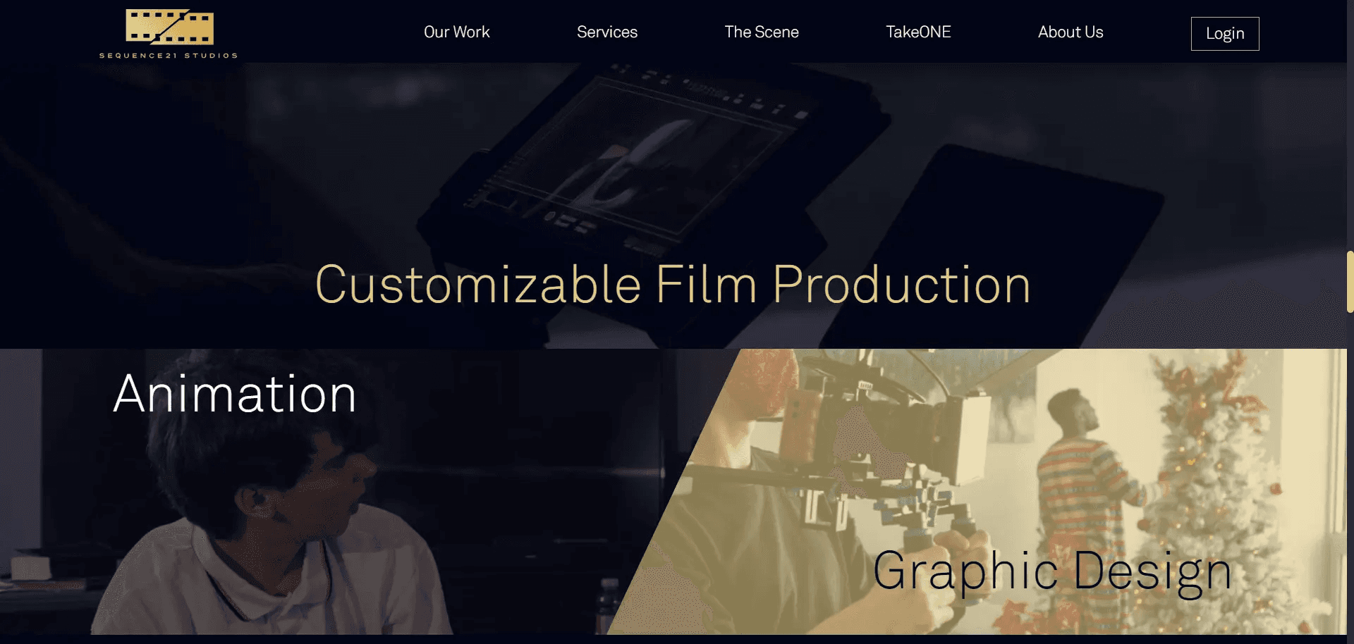
Landing page, complete with sections that link to other important pages. These sections are condensed versions or sneak-peeks into the kind of content on its respective page. The landing page should open with a flashy video, crucial for a lasting and compelling first impression.
Services page, that details a list of all services the company provides; clicking on an individual service allows you to view examples
An Our Work page, that displays all projects created by the "In House" team - which are to be distinguished separately from those of members of The Scene.
The Scene homepage, which displays a gallery of projects that can be searched or filtered by category. A list of members is also displayed and searchable.
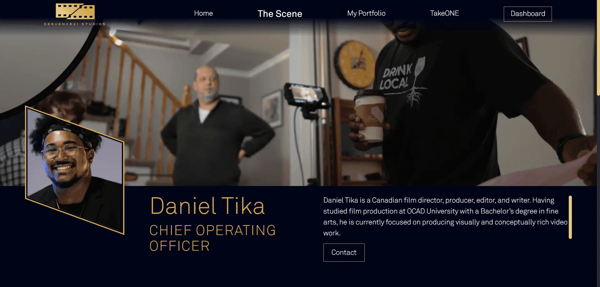
An About Us page, that gives more information about the company - including a video and headshots of the executive team.
A Contact form, located in the footer
Register and login for a member or admin account; users can create a profile and subscribe to The Scene. An admin account will have additional features to manage users and projects.
Since our client is a production company, they've already had substantial work done in branding and content creation. Therefore, we were able to partner with their own in-house designer William, who provided us with beautiful mockups for the majority of the pages we needed. In addition, we were given images and videos to add in key places, to bring the design to life. Rather than explaining it to you, we shall let you feast your eyes on it.
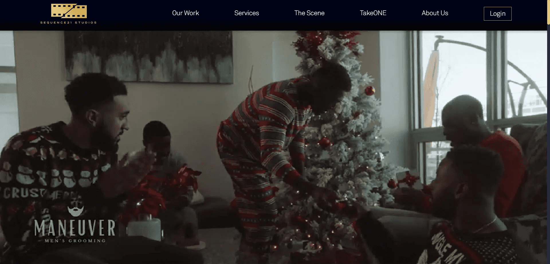
The first thing people see - an intro video (which appears after their logo fades out). We're quite proud of how this turned out.
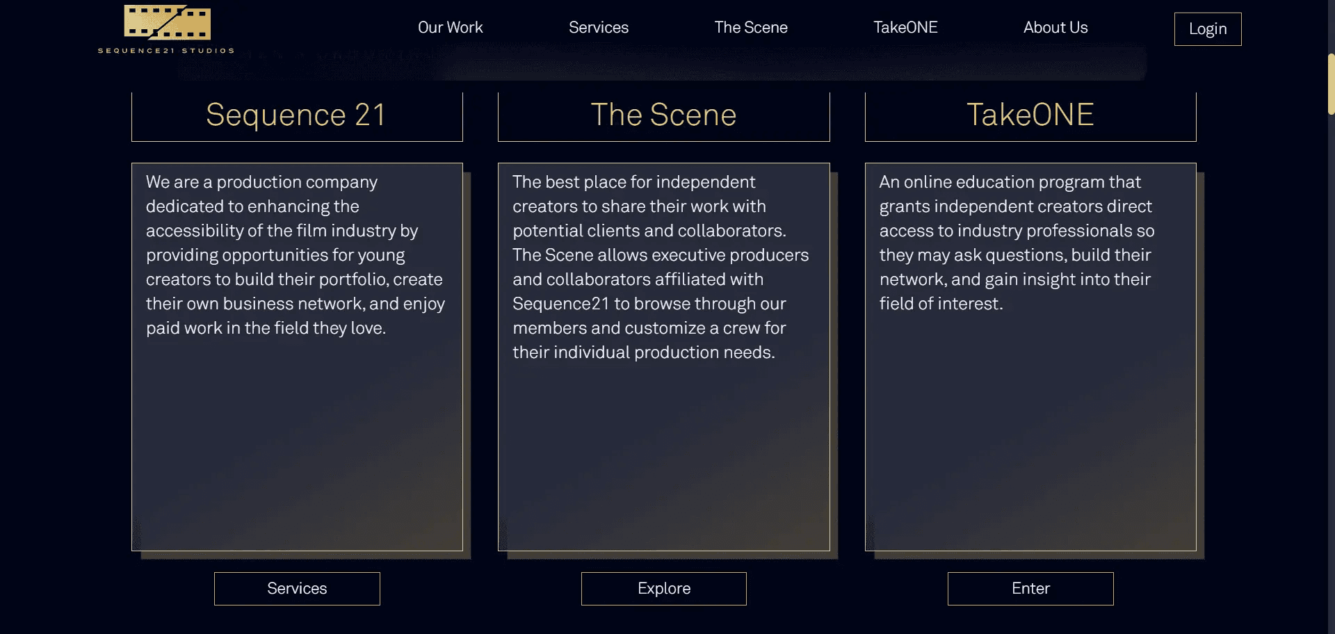
A section on the homepage displaying a list of company initiatives
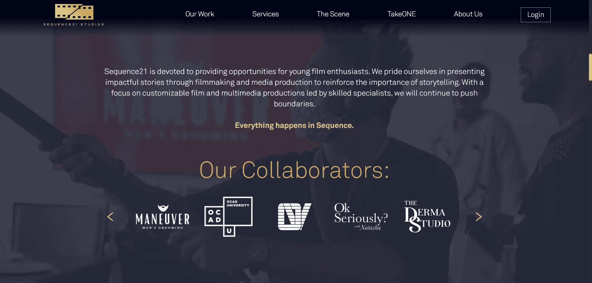
An elegant slider with the logos of collaborator companies and organizations
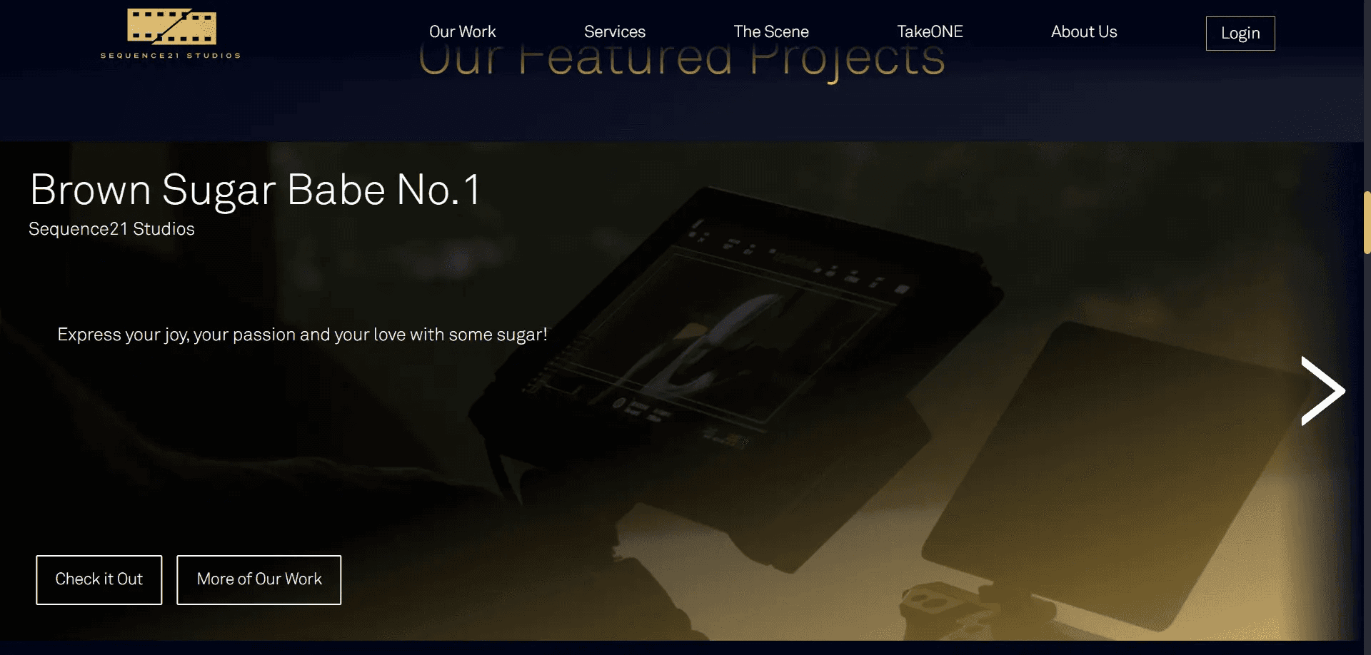
Featured in-house projects
Big buttons for the company's big services
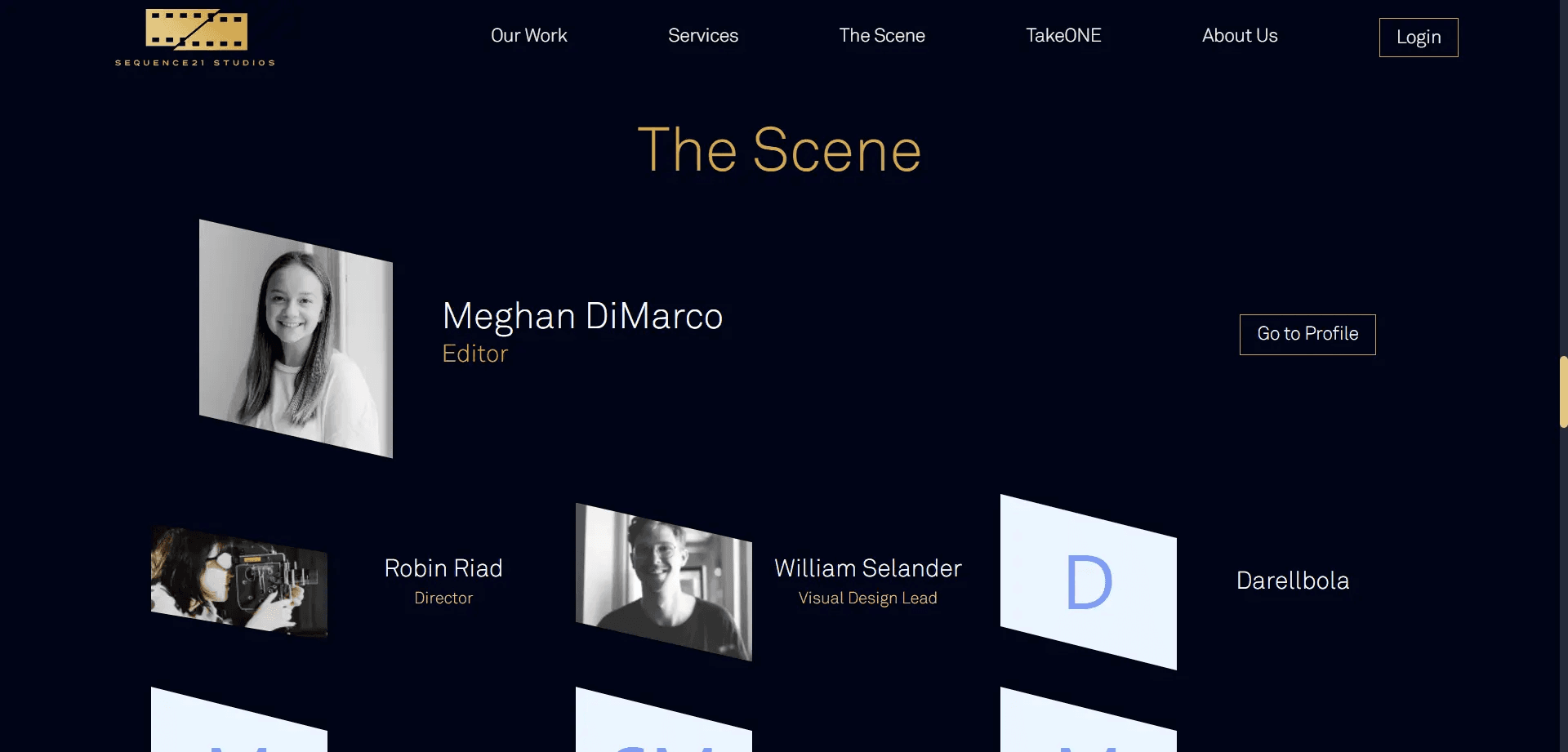
Members of The Scene

A prompt to visit the About page
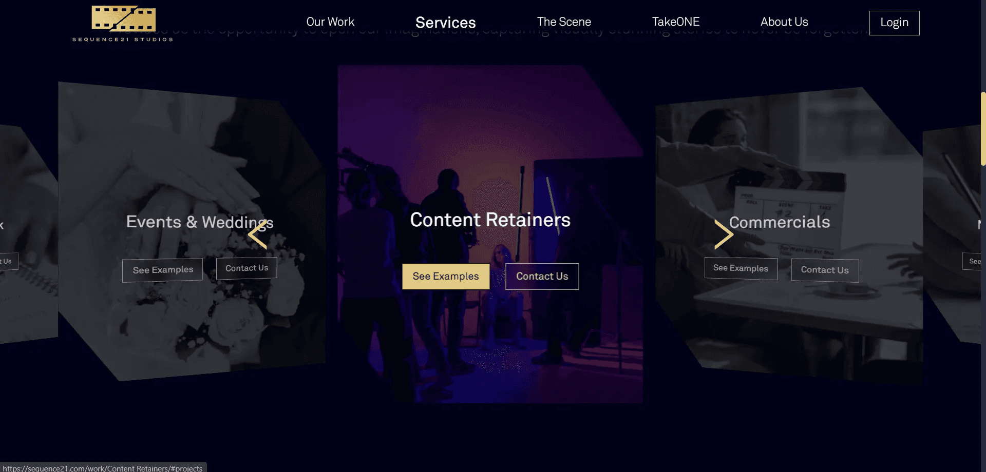
A slider of services
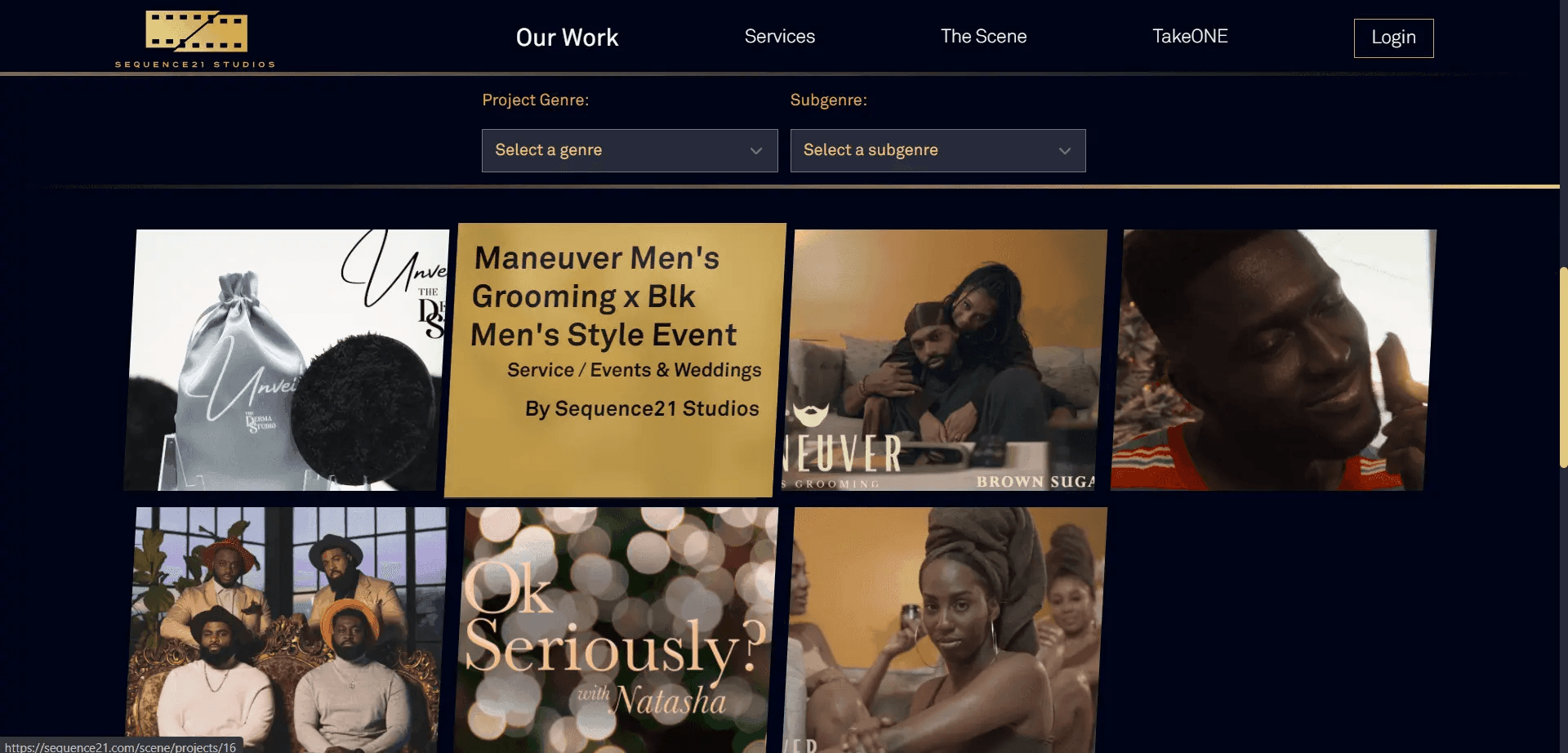
A grid of in-house projects
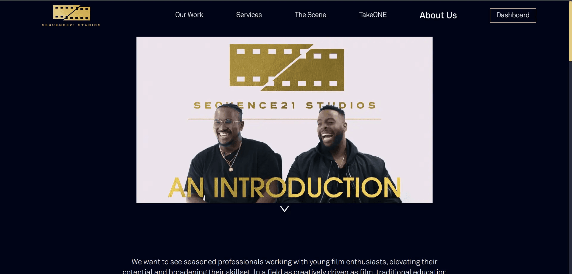
An introduction video above a short blurb on the about page
Let's go into more detail about The Scene. Like we explained above, this is a custom feature that allows users to showcase their own portfolios. This is a subscription-based service, and since we want to leave room for other features such as TakeONE (coming soon) we separated the process of creating a user account and becoming a member. Registered users will have the option to edit their account information and manage subscriptions. New users will see the option to become a member of The Scene on their dashboard after registration. Subscription payment processing is handled through Stripe.
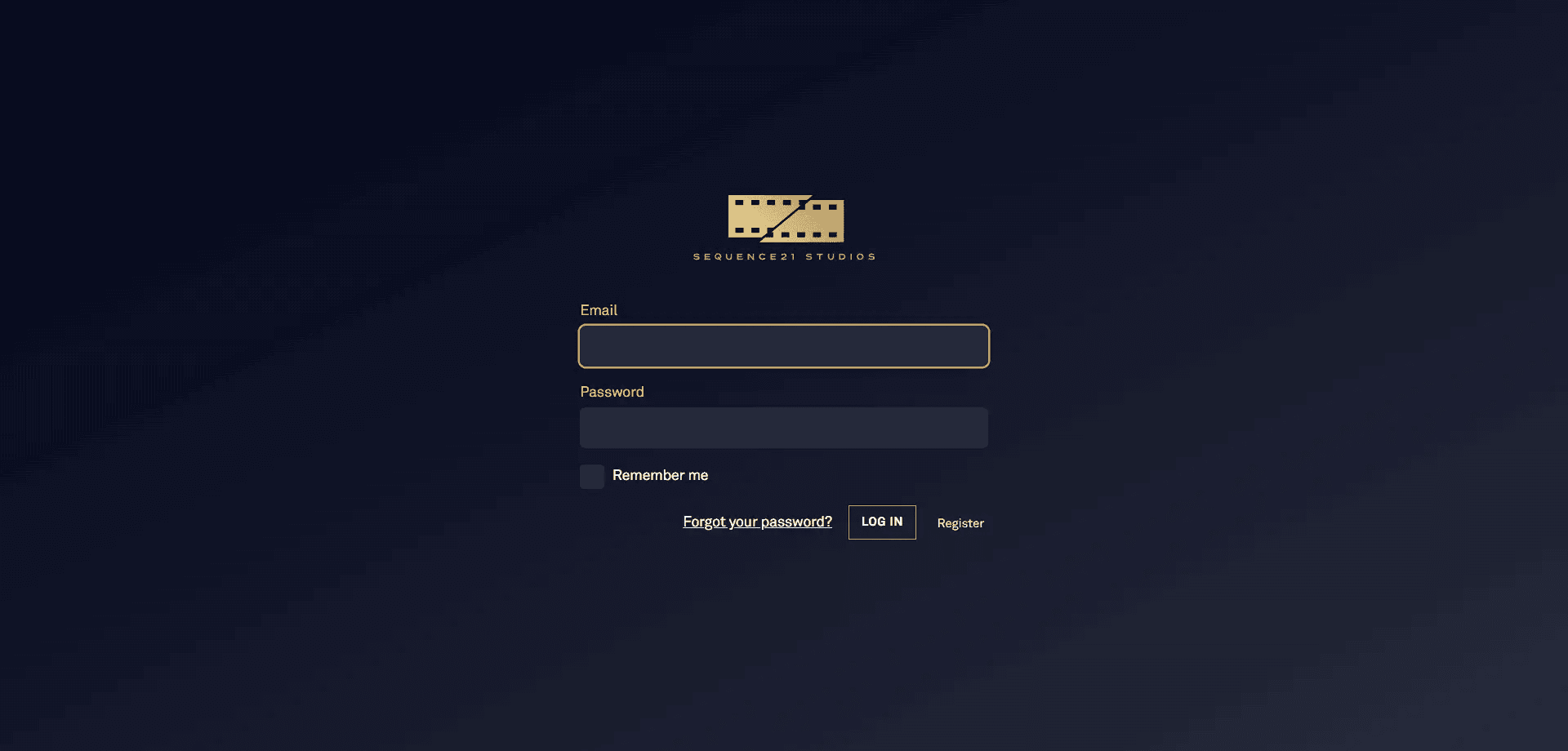
The login form with forgot password and register buttons
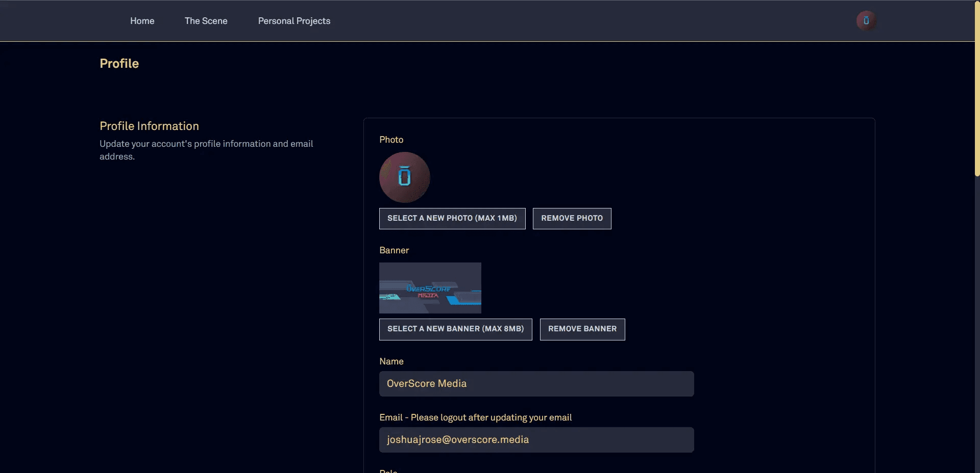
The profile information editor
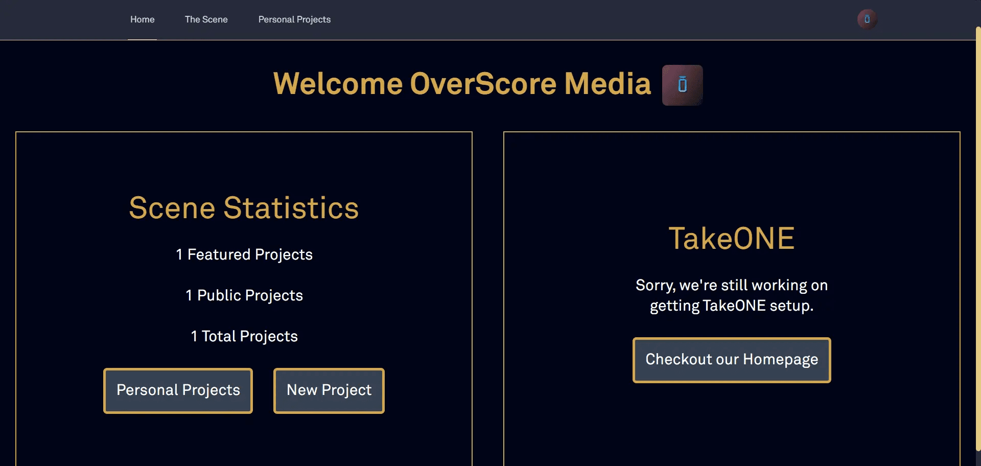
The dashboard, what logged-in users see first thing
An individual user's portfolio, with a featured project, profile picture, and short bio
Subscribed users now have access to their own portfolio. Here they can add new projects, that include inputs for a thumbnail, images, a video link (from YouTube of Vimeo), categories for selecting genre, and a list of collaborators. They can also choose to make the project private or public, so that its visibility on the site is controlled.
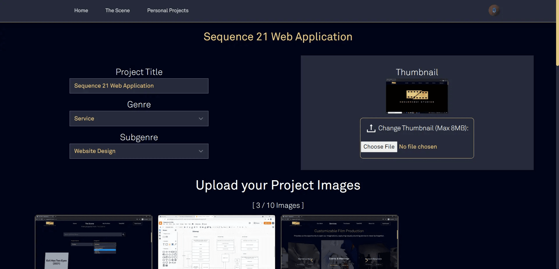
Our custom-built project editor
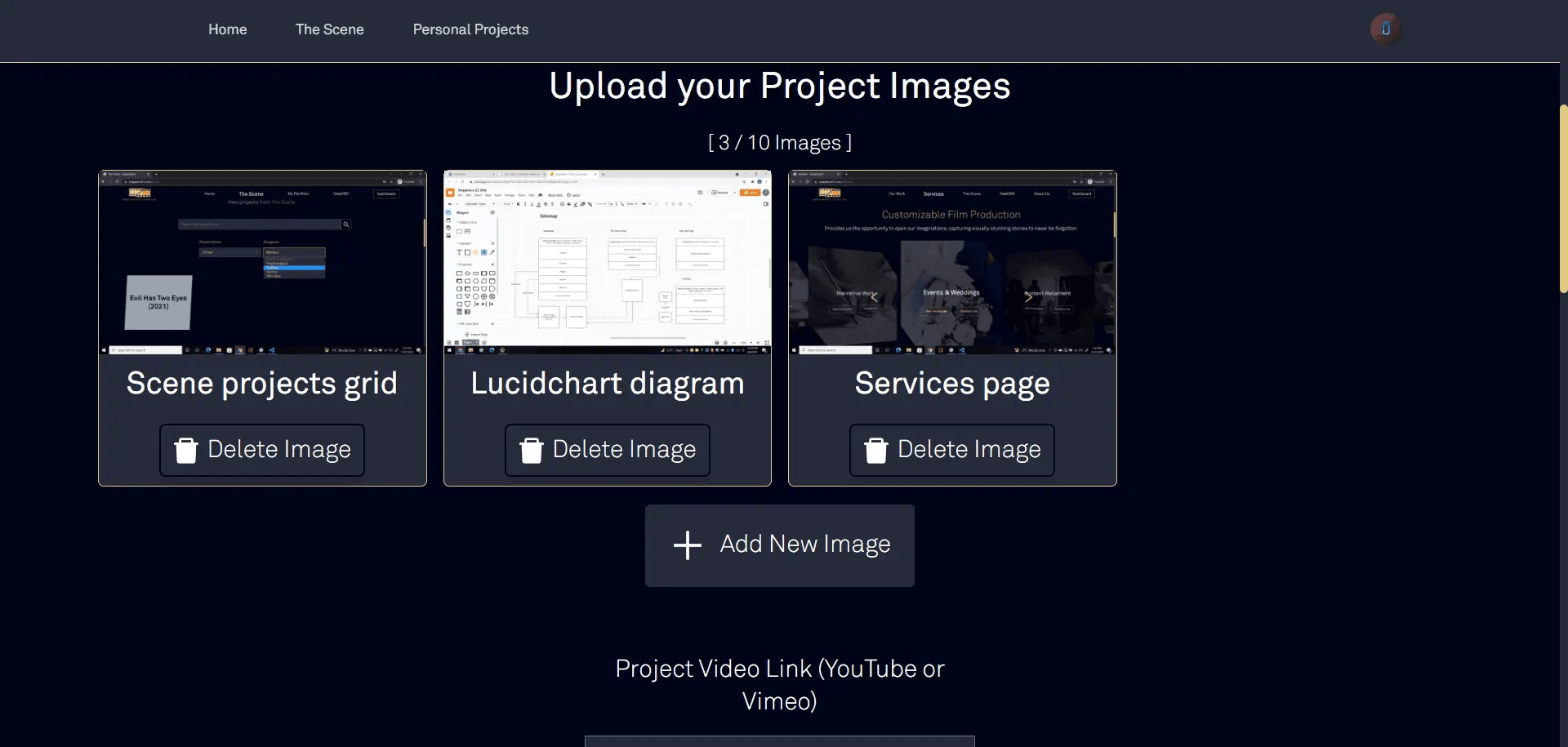
A grid of a project's images, with options to to add/delete an image
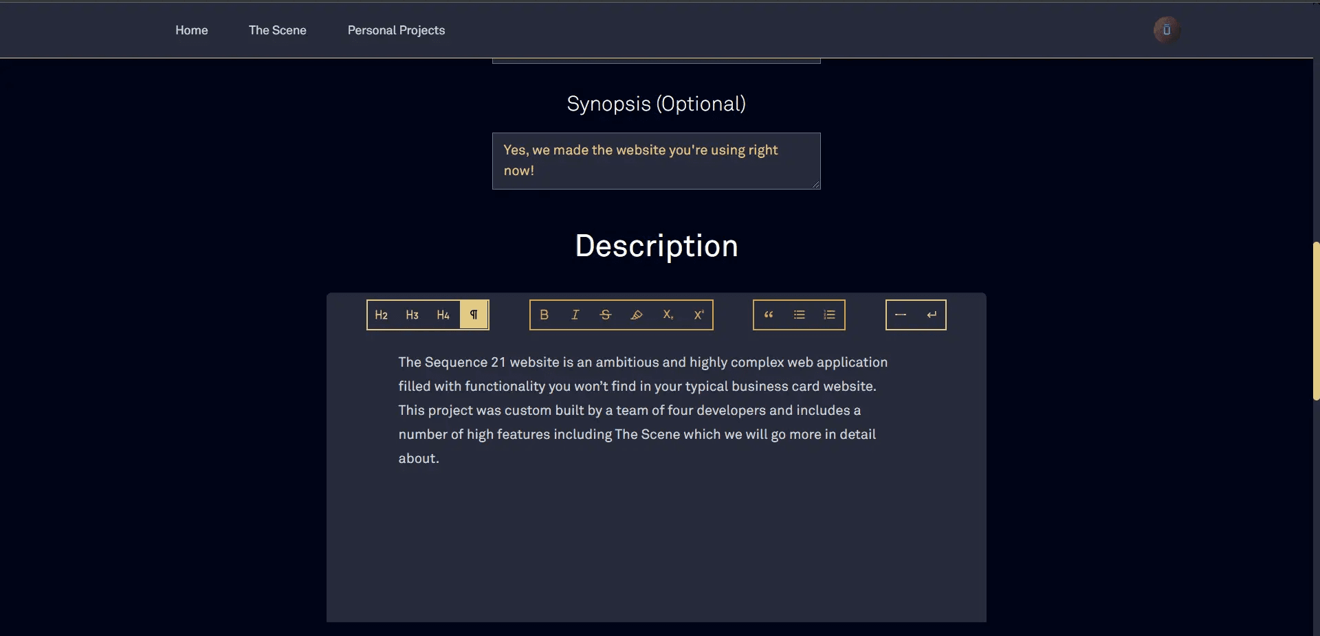
Another shot of the project editor, this time showcasing the rich-text description editor powered by Tiptap
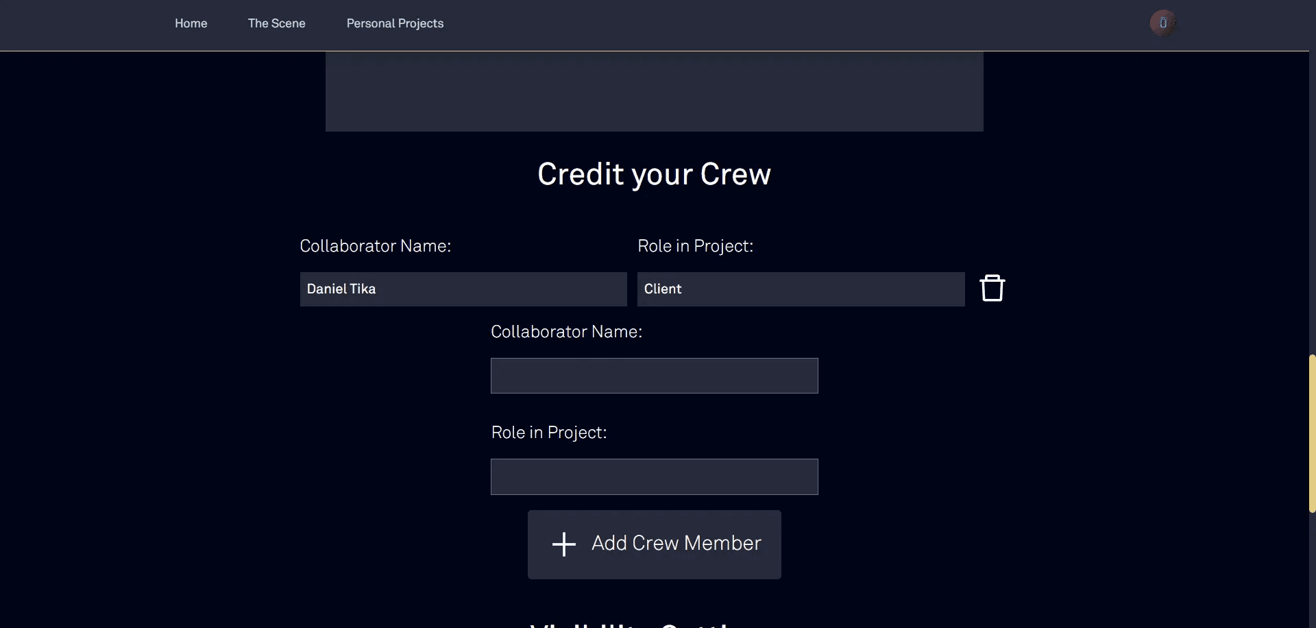
A section in the project editor to credit crew members, whether they have an account on The Scene or not
This is what a published project looks like to visitors. Published projects are also visible on The Scene's homepage, in a grid format.
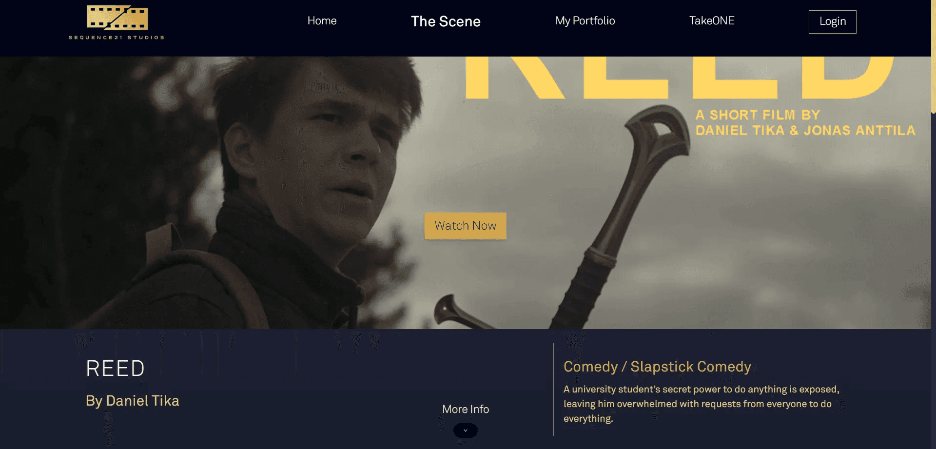
A project's page, featuring a thumbnail, a button to play a video, a title, a genre, author details, and a synopsis
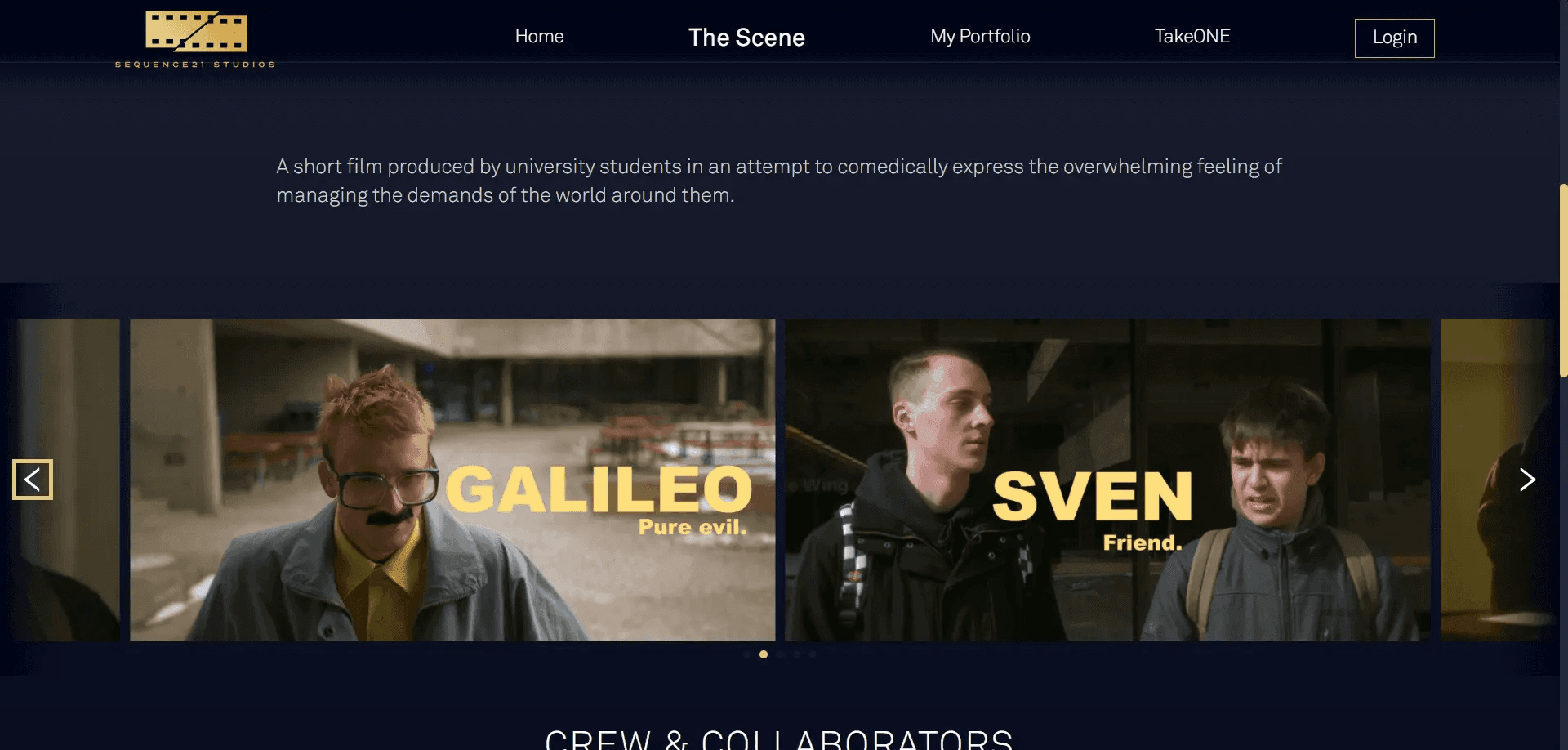
A slider of pictures associated with a given project
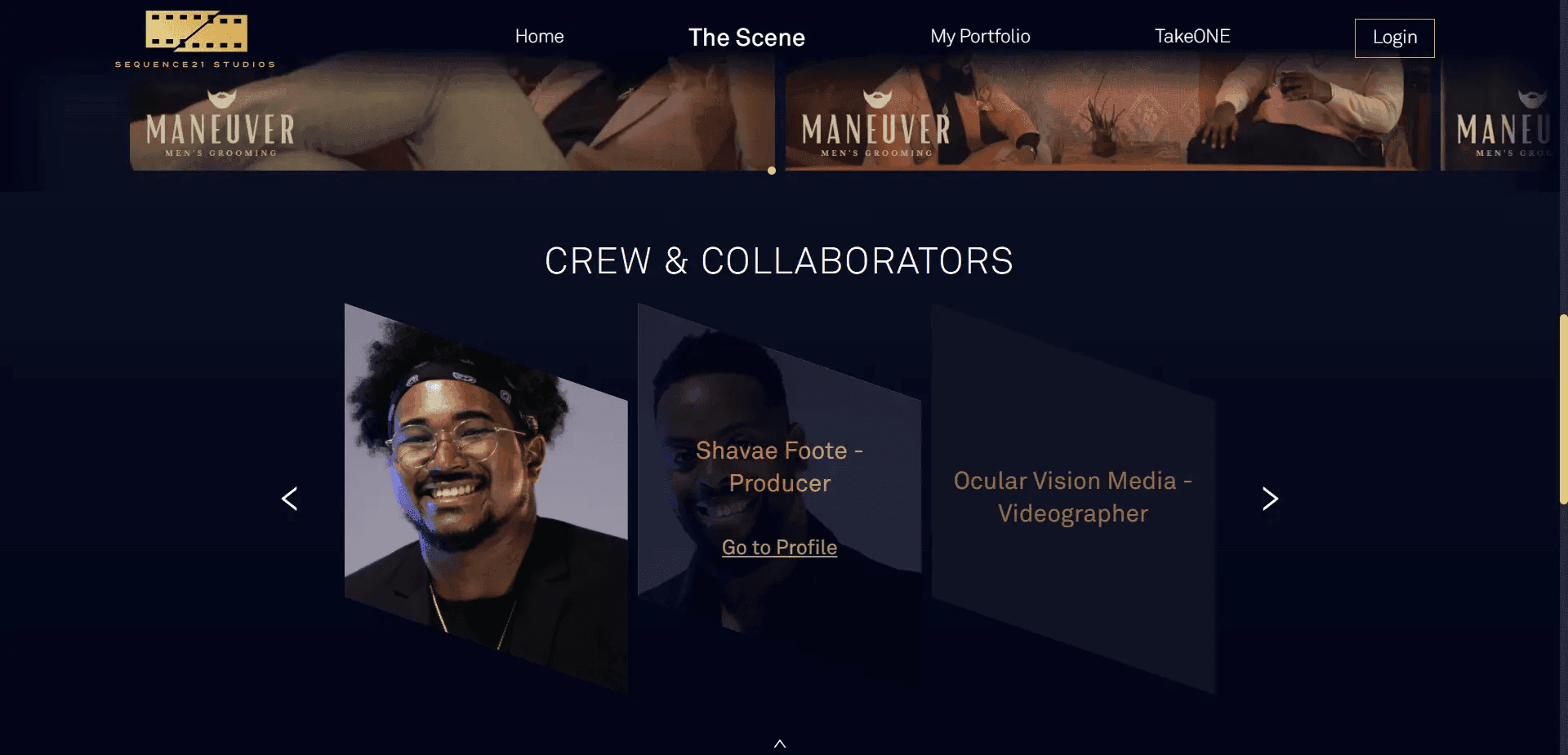
A row of project collaborators' names and pictures
This project provided many unique challenges for our team.
On the front-end, we essentially replicated the designs given to us by the client using Tailwind CSS for the majority of the styling work, as well as our own CSS and some additional libraries where applicable. The Tailwind framework makes it easy to change the look of components directly on the tag without making a huge mess or scrolling to find class names constantly. For more complicated designs, such as this row of differently shaped thumbnails, we used conditional CSS classes with the help of Alpine.js. Not going to lie, it kind of felt like magic, and we're used to this stuff 😀!
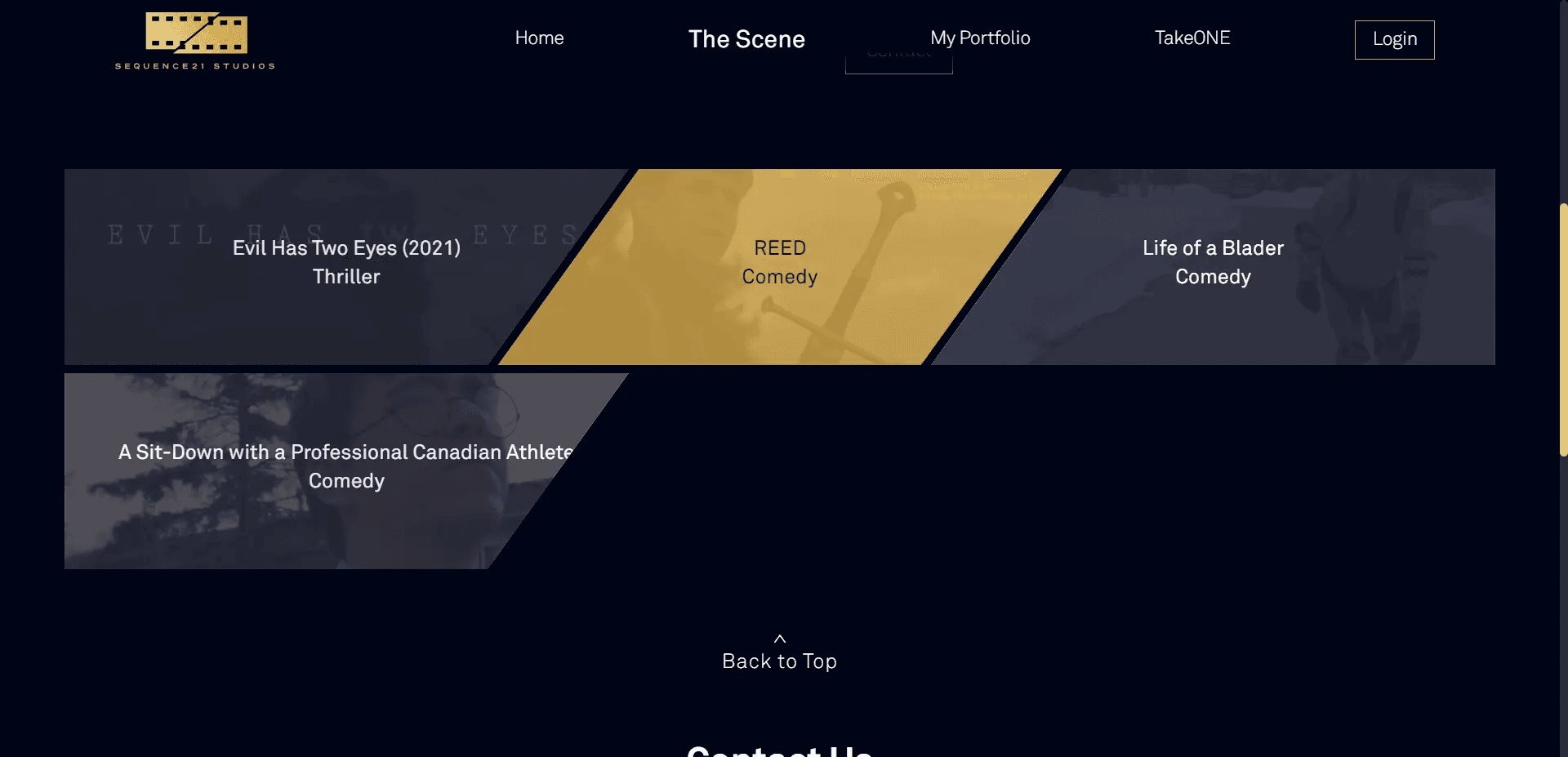
A grid of project names and pictures, as displayed on a user's portfolio page
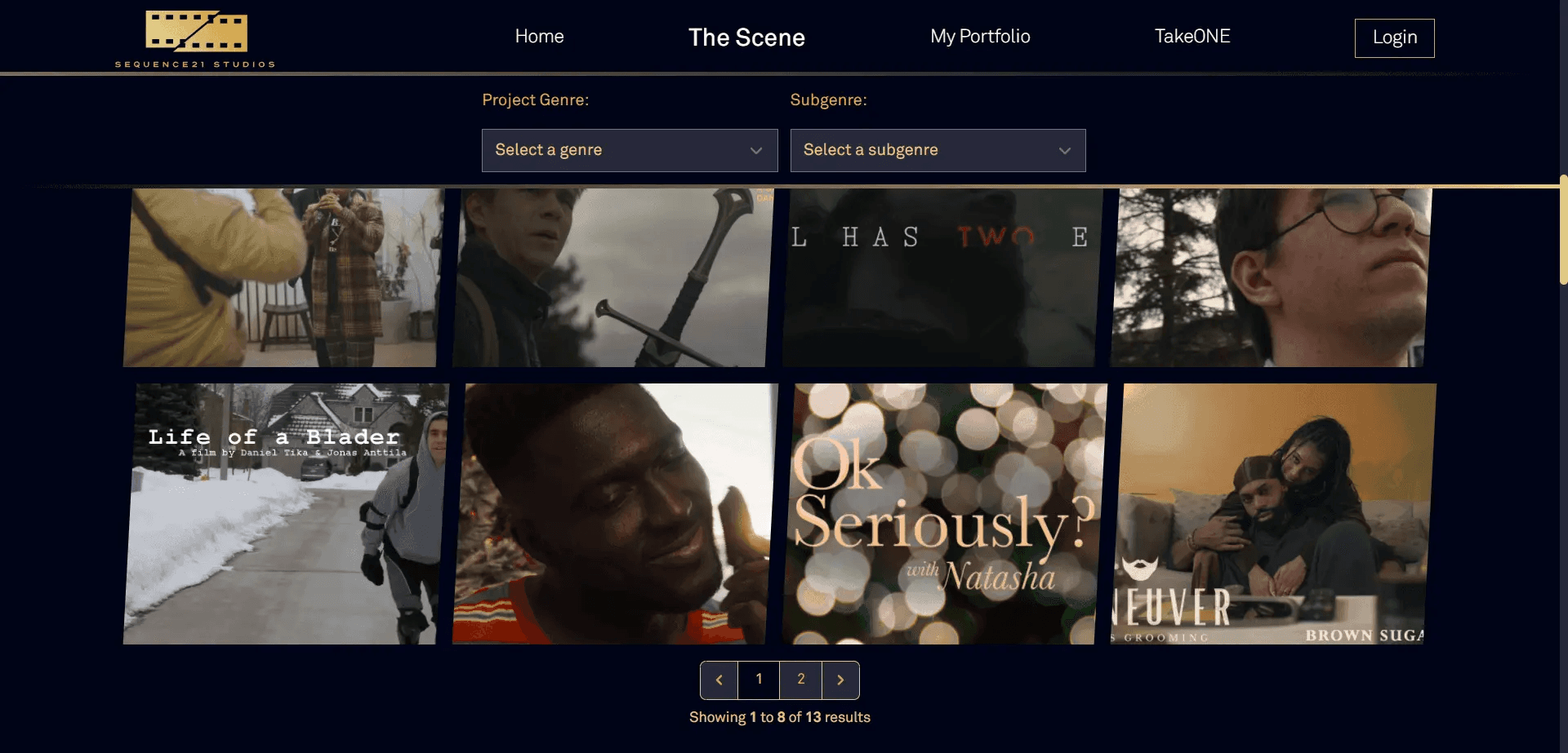
A grid of project photos, with a page selector below (this is the grid of The Scene projects)
And of course, even though designs weren't made for the mobile version of the site, we had it covered. We found a way to stick to the spirit of the desktop site, with some additional niceties thrown in for visitors on the go 😉. Yes, that includes all project editors and admin dashboards - every page is as responsive as we could make it.
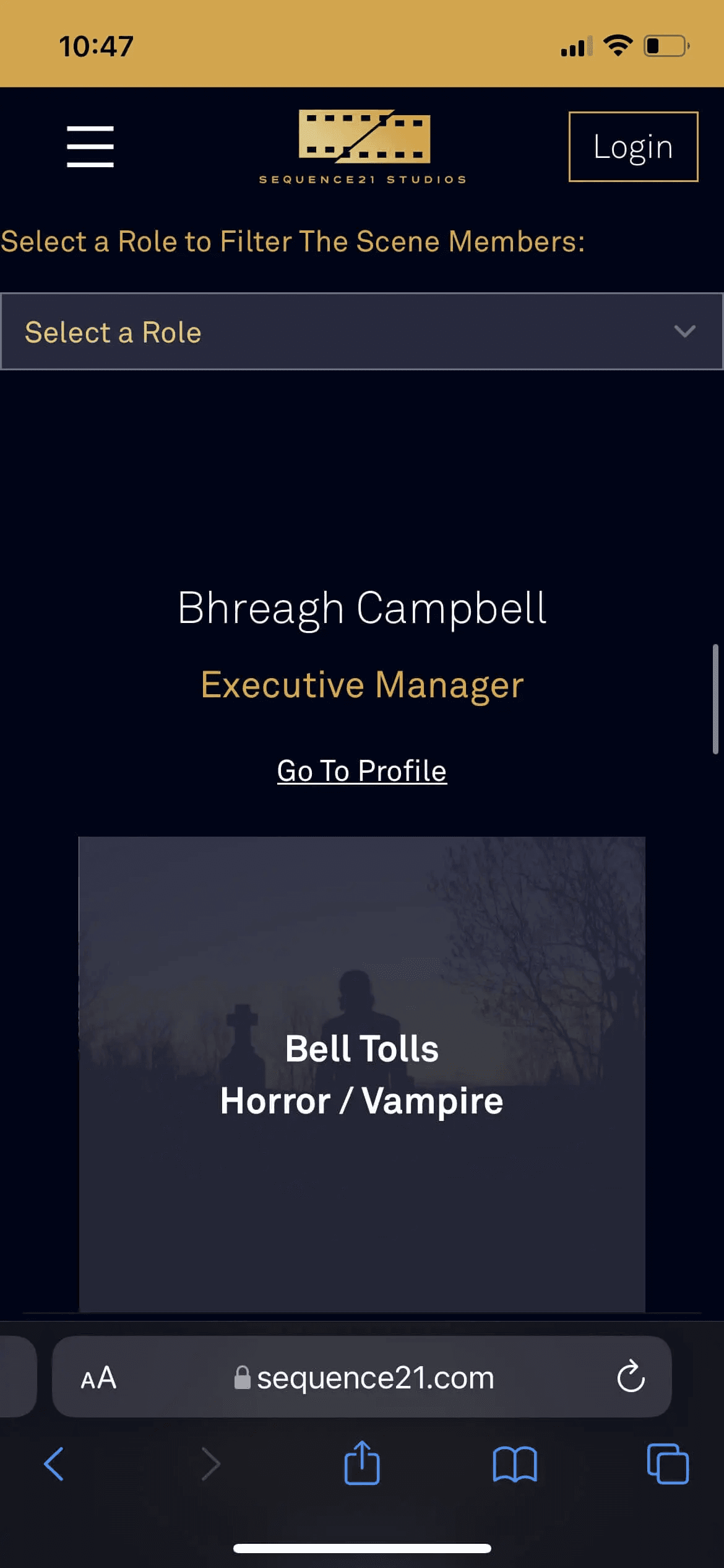
The project and member selector on mobile
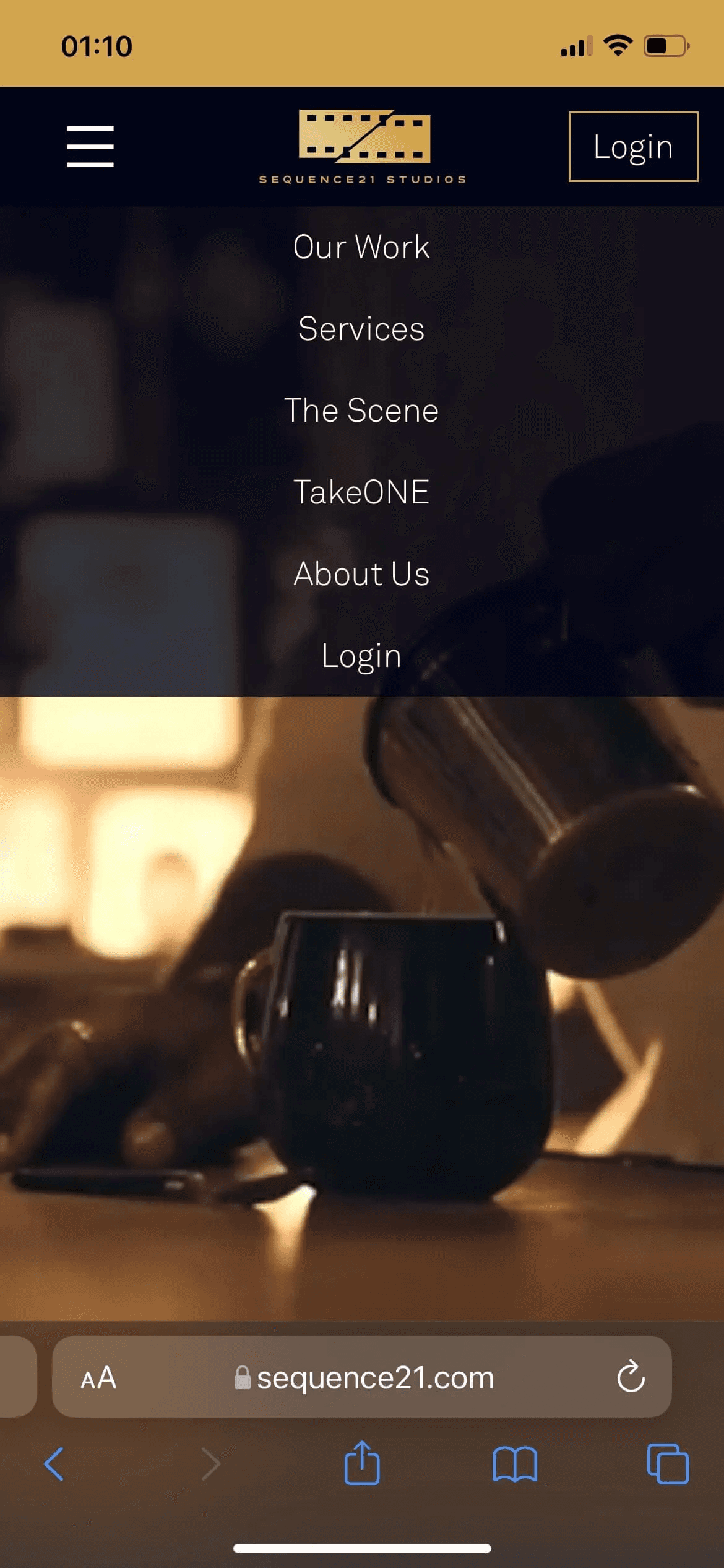
The navigation bar on mobile
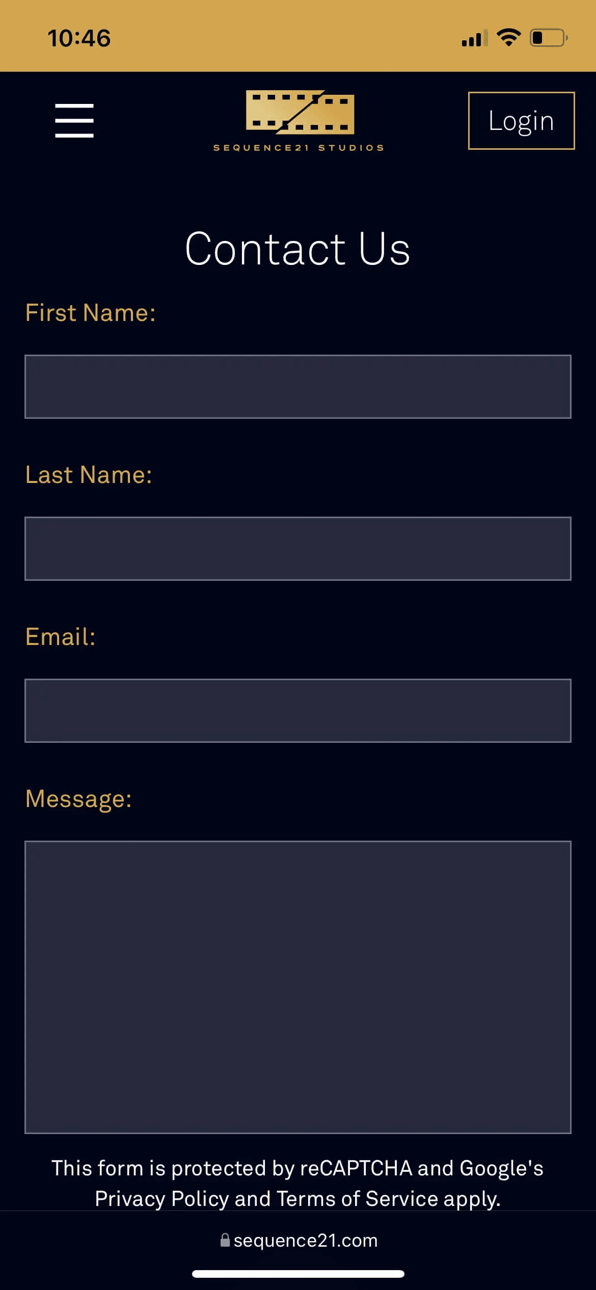
The contact form as it appears on mobile
All in all, we are really pleased with how this turned out. It's the most-complicated web app we have created to date, but we were able to bring a unique flair and pragmatism to the project that resulted in a very nice-looking site that is also extremely functional for visitors, users, and administrators.
We learned a lot from this project, and going forward we are confident we can tackle something of equal or greater complexity. We are also looking forward to continue working with Sequence21 Studios in the future.