
OverScore Nexus
OverScore Media's next-gen blogging engine and content management system

Here at OverScore, we like to keep ourselves informed about the latest developments in the software and web industries. Although we understand that the best tool for the job isn’t always the newest one, we also love to experiment with brand-new tech, and push it to its limits. We believe that every project we create for our clients should represent the best we could do for them at the time, so that’s a major incentive for us to keep learning and honing our craft.
Another thing we do here at OverScore, when we feel it’s necessary, is to make our own tools. OverScore Nexus is the result of the combination of these passions.
Nexus is the culmination of several months of research, experimentation, testing, and incremental improvements upon a solid foundation. And it is currenly still in active development, so expect to see changes to this page as we drop new features. This page will serve as a showcase of the current state of Nexus, and of the many lessons we learned while constructing it. We hope you enjoy this part-retrospective, part-exhibition on a web application we’ve poured our hearts and souls into!
OverScore Nexus is a custom-built content management system. It is primarily used to update the content of this very website, our company homepage. At its core is our very own blogging engine, a content editor chock full of the features we need to bring our content to life. While there are numerous blogging and content management systems out there, we found that - for our specific use-case - most of them either did not try to do enough, or tried to do too much.
The initial internal pitch for Nexus was to make a blogging engine that would be natural and comfortable to write with, and one that could support many types of content, in addition to plain text and images. We wanted a proper web application that supported multiple users, and had a distinction between admins and editors - with each user able to edit their own profile page. We also wanted a system that allowed blog posts and company projects to be given many different types of metadata, including categories, hashtags, and tech stack items. And to top it all off, it needed to provide excellent SEO, and connect up to our current company site. While a casual examination of these requirements might make such a system seem rather easy to develop, we knew that there were going to be some serious challenges to overcome. But, with a proper architectural foundation, and through the use of powerful tools to aid in development, we decided it would be worth it.
Now, the fundamental building block of content in Nexus is the widget (similar to the concept of a “Block” in the WordPress editor). Widgets can come in a number of types. Currently Nexus 1.1 supports the following widget types:
Text (including rich text editing, powered by the Tiptap editing framework)
Image (supporting alternative text and captions)
Gallery (for multiple images at a time)
YouTube Video
3D Model (Supporting GLTF models visualized by Google’s <model-viewer />)
Code Block (for displaying a block of beautiful syntax-highlighted code)
Audio (for the playback of sound files)
And there are more on the way. Widgets were an excellent idea, because new types of widgets can be developed and incrementally added, without having to rip apart the whole blogging engine and start over. And since each widget type can manage its own data, the challenges of handling things like 3D models can be separated into different functions, so as not to overcomplicate the handling of all other widget types. In the software world, this concept is known as separation of concerns, and is quite powerful.
While you can see all of the different widget types in use elsewhere on our site, we will provide a brief demonstration of each type of widget below. Enjoy!
Here is an example of a text widget. It can do plain text, bold text, italic text, underlined text, striked-out text, superscript text, subscript text, code snippets , and links.
It can do bulleted lists,
It can do numbered lists,
And it can do blockquotes.
Text widgets can also do different sizes of headings, to help delineate long blocks of content:
^ and horizontal lines, like the one above.
And if that wasn’t enough, text widgets also support tables. Yes, tables!
Heading 1 | Heading 2 | Heading 3 |
|---|---|---|
Merged cells | Single Cell | |
A big cell that spans multiple lines | ||
Pretty cool, huh?
Now here’s what text widgets look like from Nexus’s interface:
(Note that the table editing buttons aren’t there by default. Text widgets don’t normally look this cluttered.)
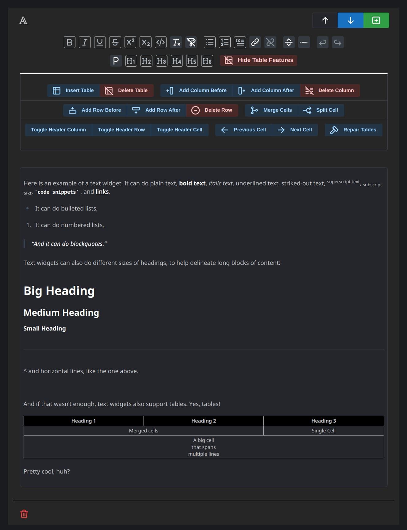
Now that's what I call rich text!
Now, here’s an example of an image widget:

Image widgets support, well, an image. With a rich text caption!
And this is what image widgets look like from Nexus’s editor:
(Also note that the “Image Metadata” section isn’t open by default, either.)
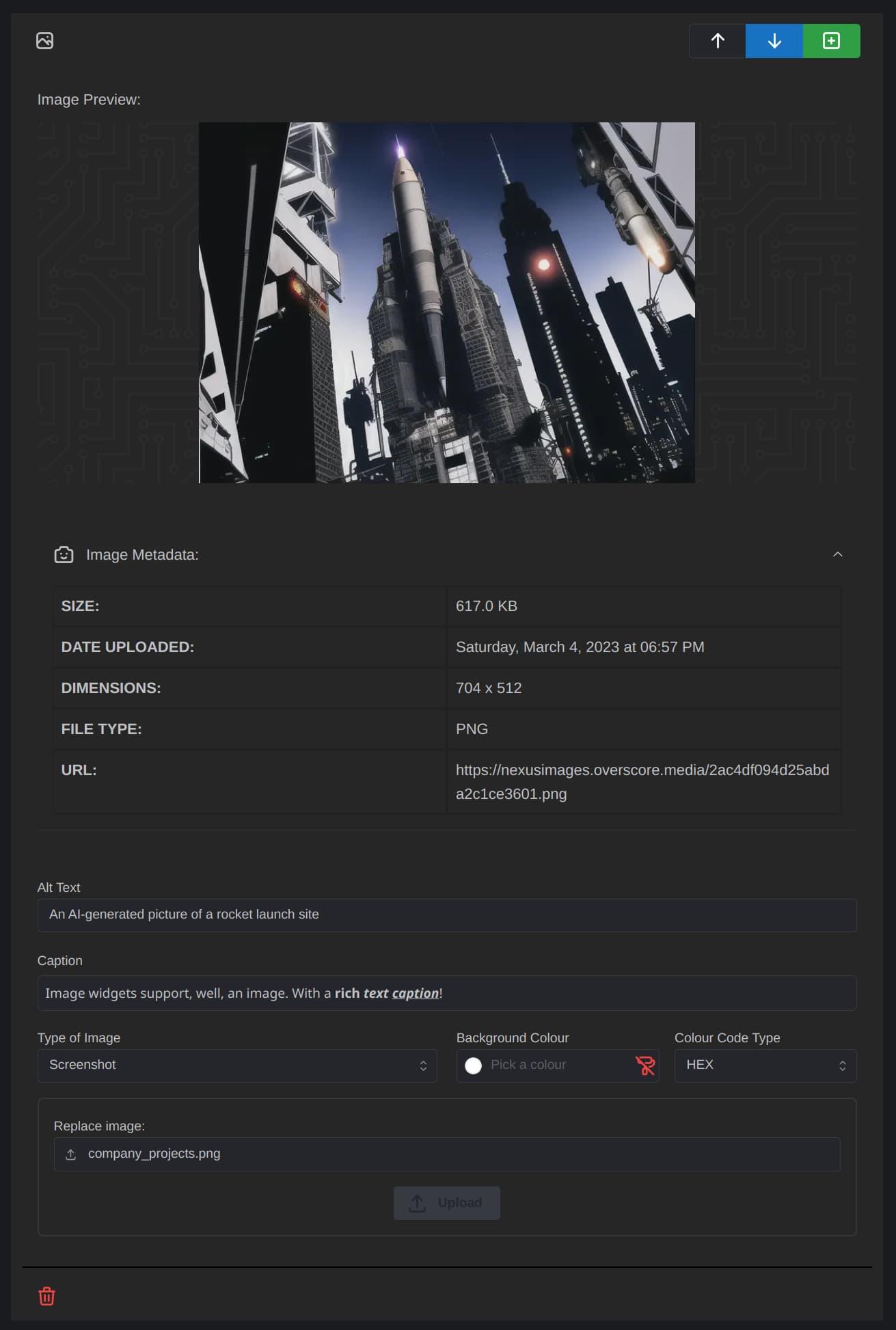
Image Widgetception
Image widgets are great and all, but sometimes it makes more sense to display multiple images in a slideshow. Enter, the gallery widget!
Gallery widgets can have multiple images inside them. Click on this image to view the full-screen slider!
Gallery widgets are pretty cool. We’re really satisfied with how they turned out. Being able to slide left or right to view all the images, even if you’re in the fullscreen slideshow, is a very nice feature. Here’s what a gallery widget looks like from Nexus. It’s basically like an image widget, with mini image widgets inside it.
You can add, edit, rearrange, or delete the images within a gallery widget as you see fit.
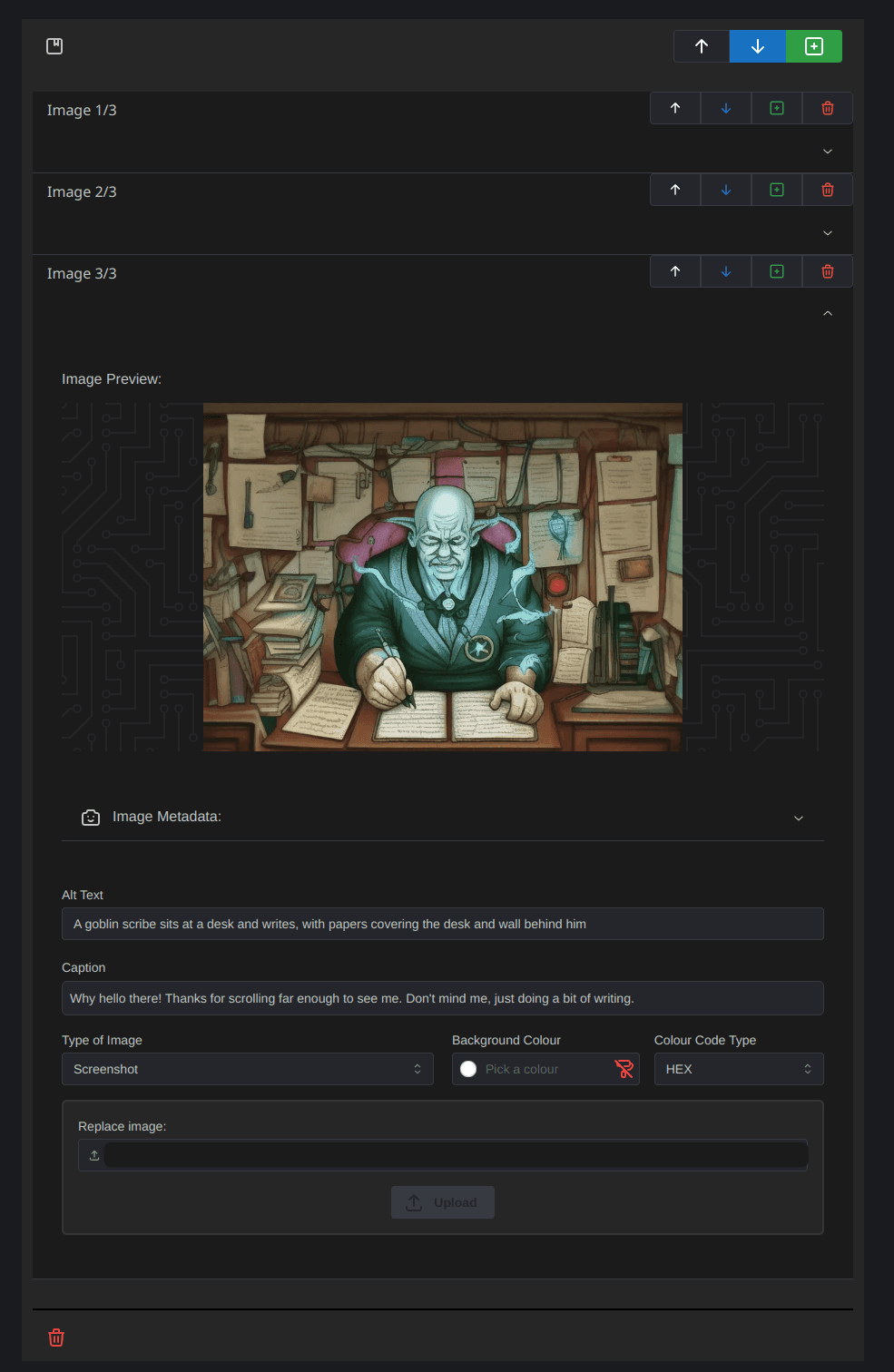
There's an "accordian" style interface, that lets you edit the properties of one image at a time. Very convenient.
YouTube widget time:
(Fireship is an awesome channel that covers a wealth of software and web topics, btw.)
YouTube widgets look like this on Nexus:
(The “Change YouTube Video” button opens a prompt to type in a new YouTube URL.)
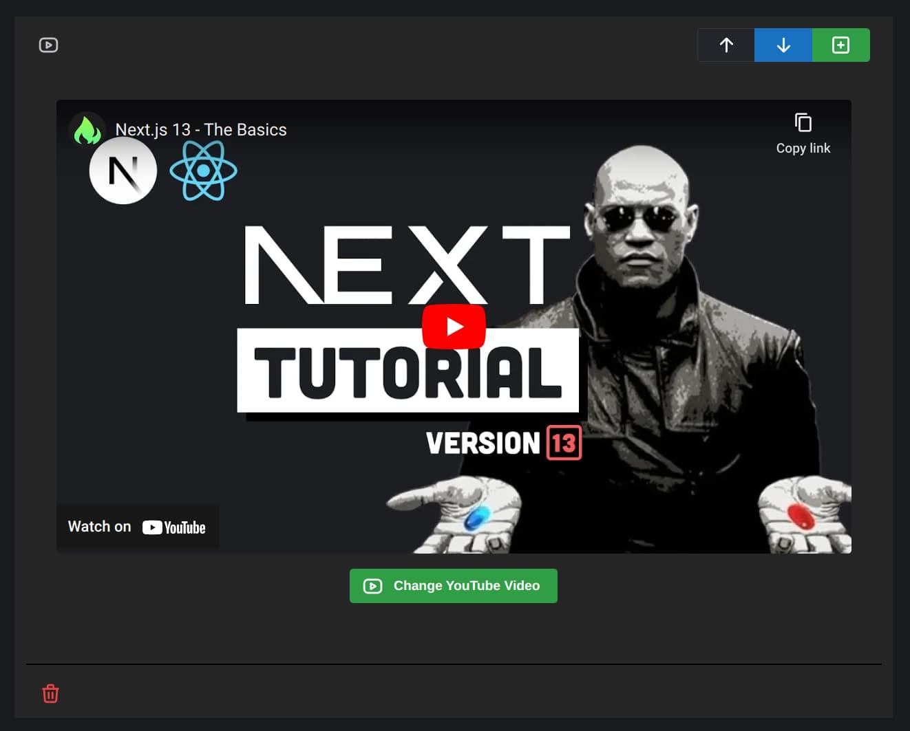
This is your last chance. After this, there is no turning back.
And now, here’s a 3D widget!
On Nexus, 3D widgets are pretty simple, but there’s a button to take a new screenshot of the model (that will appear before you click on it to view the model in 3D).
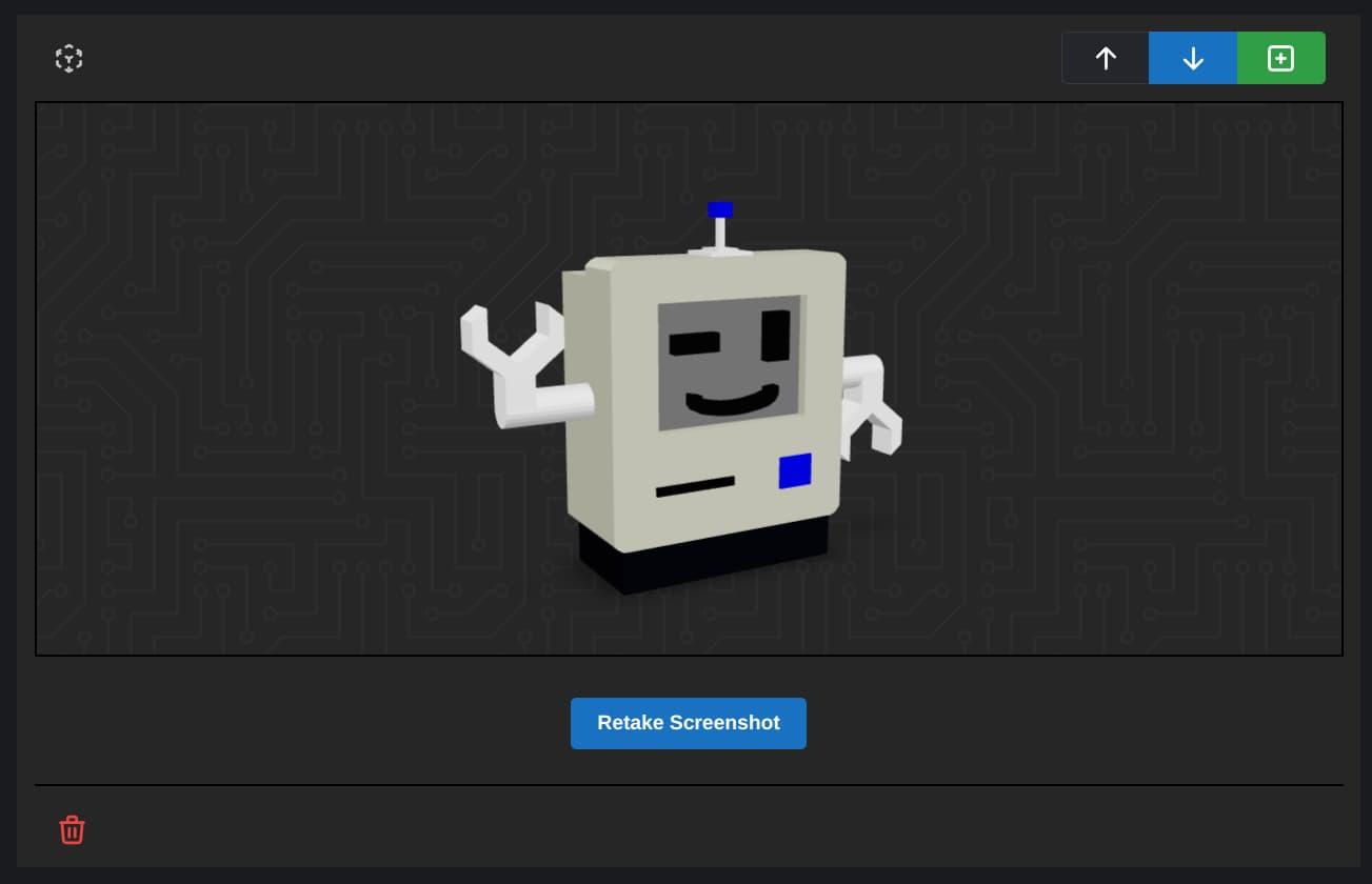
That 3D model, by the way, is Chippy the Robot. This little guy has been places. We’ve turned him into pixel art, a vector logo, and even a 3D-printed figurine!
By the way, here’s a 3D-printable model of Chippy, on Thingiverse.
Next up, code block widgets!
export default function CodeBlockWidget({ initialContent, onChange }) {
  // ...
  return (
    <div className='w-full mb-4 mt-1 p-4'>
      <Select
        size='lg'
        className='w-full md:w-1/2 max-w-screen-sm mt-2 mb-6 flex-grow'
        label='Language'
        value={programmingLanguage}
        onChange={(newLanguage) => changeLanguage(newLanguage)}
        data={lowlightLanguages}
        nothingFound='No languages found'
        searchable
      />
      <CodeBlockEditor />
    </div>
  )
}
Woah, now, let’s not get too meta. That’s a code block widget displaying the code for code block widgets!
Anyway, sometimes the best way to describe something is to show me the code! So, we developed code block widgets, to do just that, in style! Look at all those pretty colours.
Code block widgets look like this from our end:
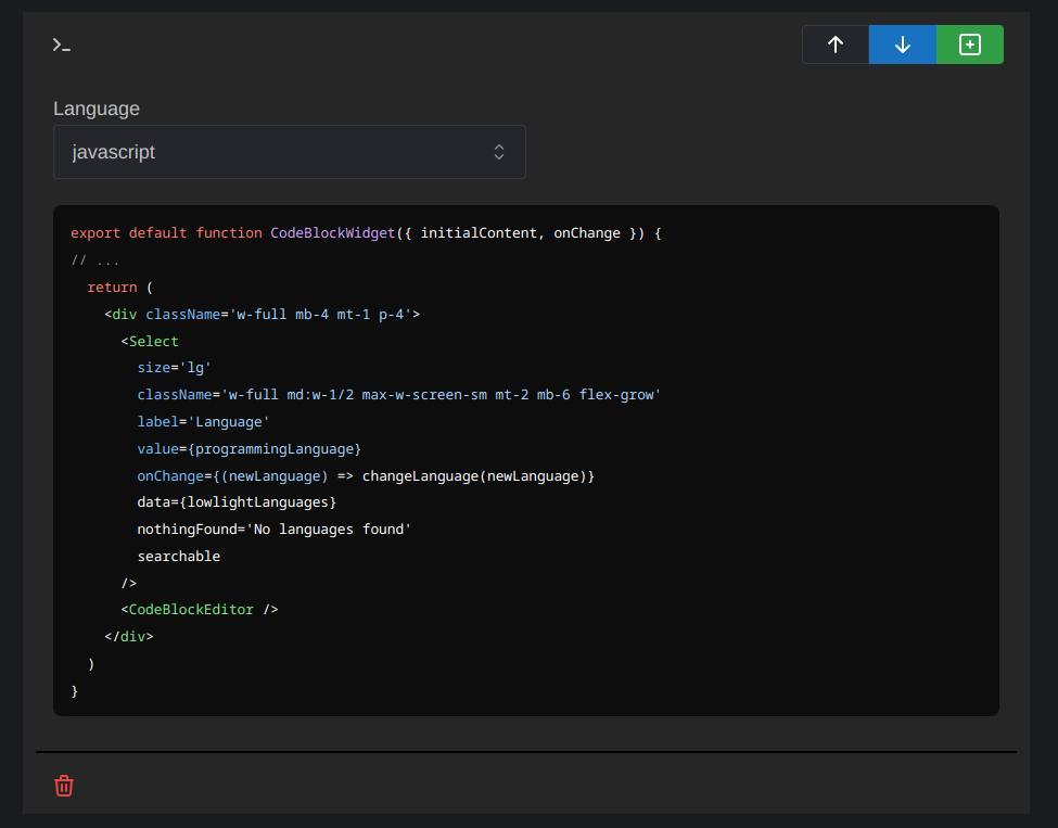
Admittedly not as pretty as the version you see, but it does the job. We can set the programming language in the top-left corner, to ensure the syntax highlighting works just right
And last (for now), but certainly not least, the audio widget!
Audio widgets are a lot of fun. It’s like leaving a voice memo. Sometimes you just want to get your thoughts out there, in audible form. Well luckily, our custom player makes it easy to listen along!
Audio widgets look pretty similar on Nexus to how they look here on our site:
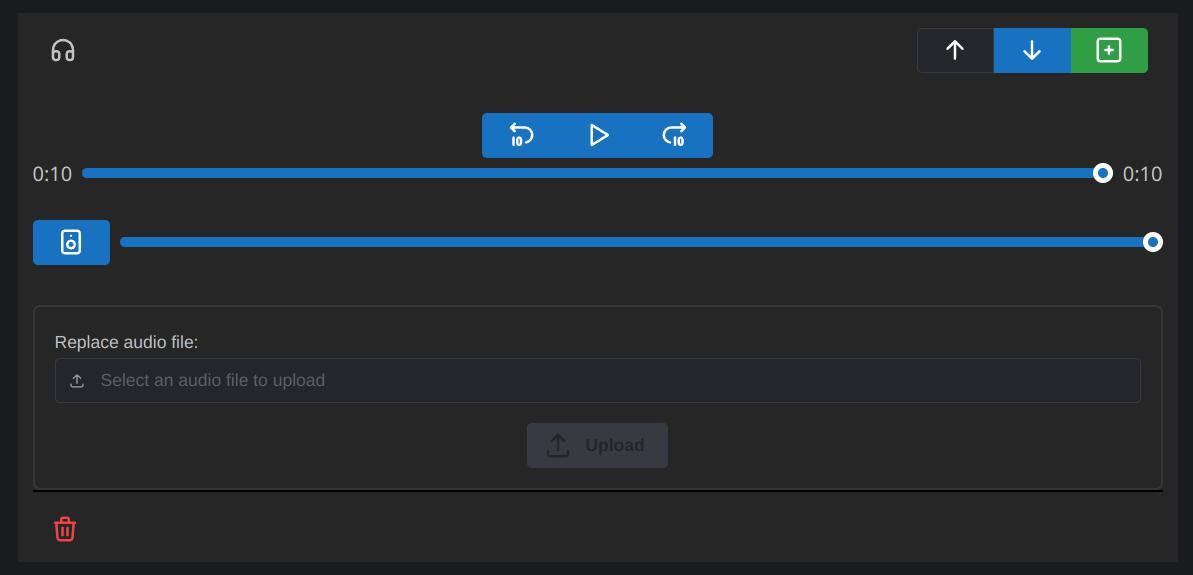
We had a lot of fun coming up with these different types of widgets. And they make it easy to add lots of different types of content to our blog posts and company projects. We’re constantly looking for ways to improve Nexus, so we might end up adding some more types of widgets in the future.
The editing workflow on Nexus itself is very natural, and kind of relaxing, really. It doesn’t get in your way, allowing a smooth flow of ideas, from your mind to the virtual page. And those ideas then get rendered beautifully on this website, thanks to Tailwind Typography.
Widgets themselves can be moved up or down the page, and you can add a new widget (of your desired type) anywhere you wish. And if you want to get rid of a widget, simply click on the little garbage can icon in the bottom-right corner of the widget.
So, widgets are pretty cool and all. And granted, they make up the core of Nexus’s functionality. But as proud as we are of the way widgets have turned out, there’s more to Nexus than just widgets.
For one, there’s the different types of metadata we can add to blog posts and company projects.
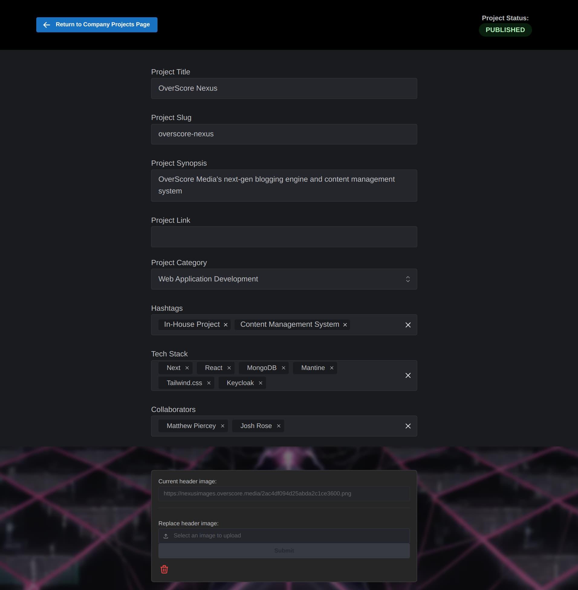
Maximum metadata. Gotta get that sweet Search Engine Optimization!
Check it out! We can add categories, hashtags, and tech stack items to blog posts and company projects, as well as customizing attributes like the title, slug (which goes in the URL), link (for any company projects with a live URL), and collaborators (for displaying the list of people who worked on a given company project).
And every blog post and company project can have a header image, to make it really pop!
But let’s take a step back from the blogging engine, and see some other parts of Nexus, shall we?
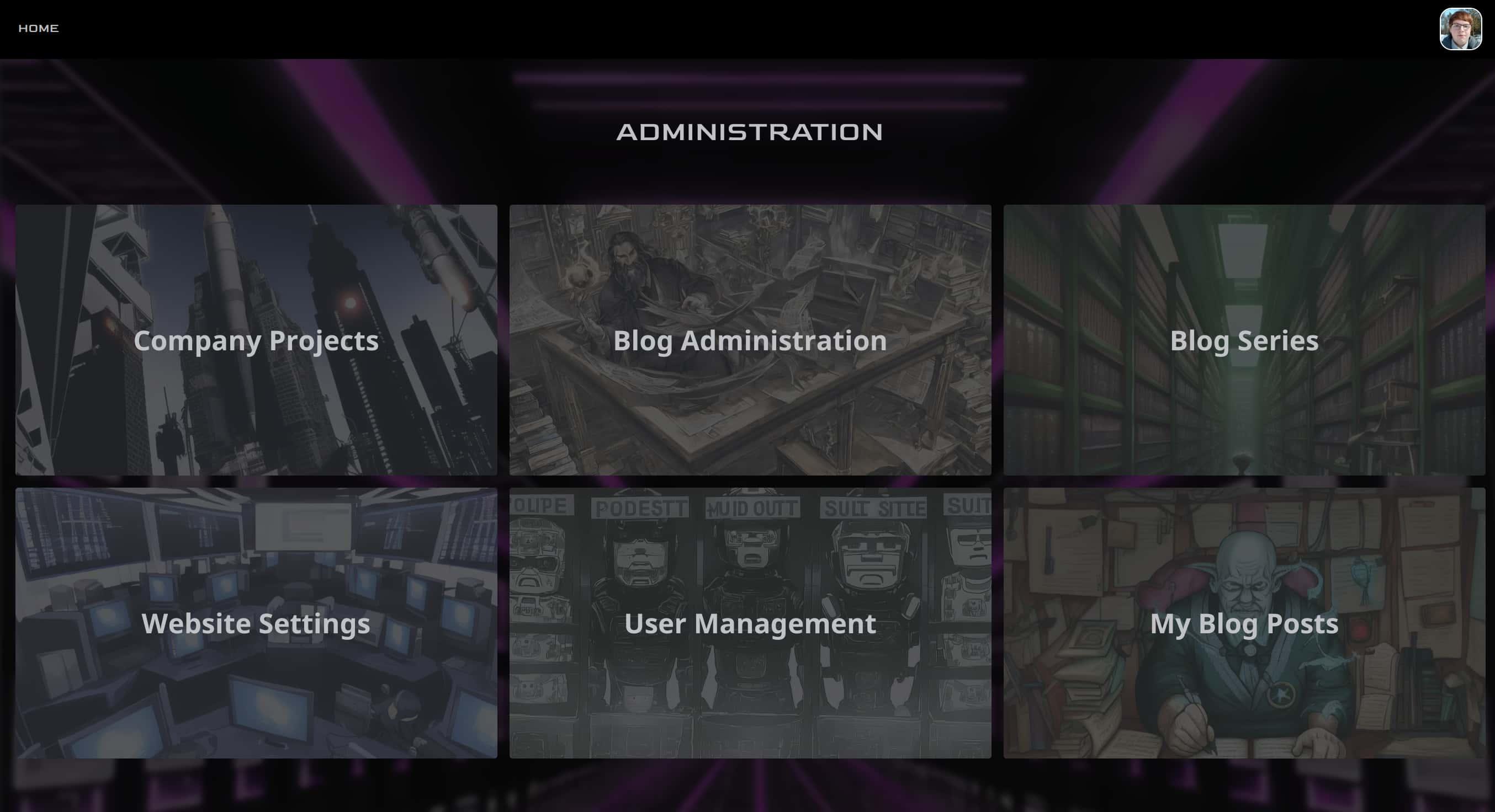
Here's the dashboard
We had a lot of fun using Stable Diffusion for generating the background images seen on Nexus. But that’s a story for another time.
From the dashboard, a non-admin user will see their own blog posts, as well as having the ability to edit their own user profile. By the way, a user’s profile editor looks a lot like the editor for a blog post or company project, with a place for metadata and a place for widgets.
An admin user will see all of that, plus company projects, the editorial page for the administration of blog posts, a page to create and manage blog series, a page to manage Nexus’s users, and a page to edit the settings of this very website.
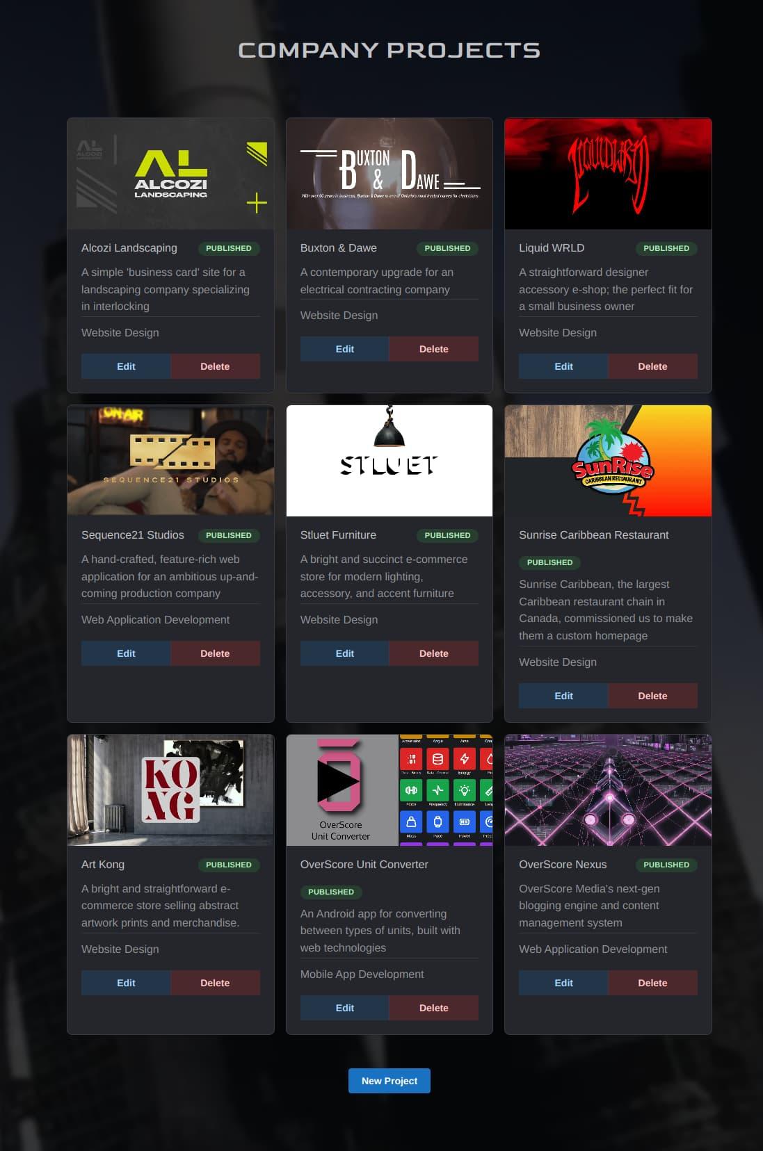
The Company Projects page
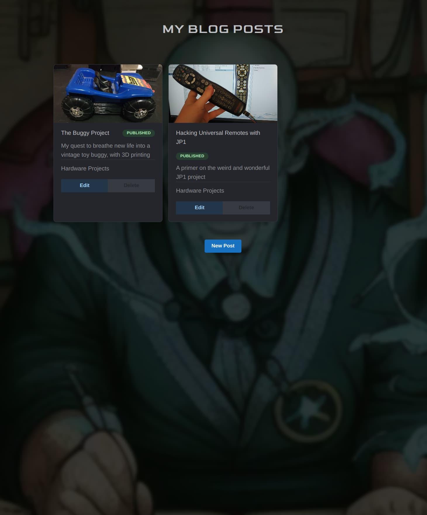
My Blog Posts page
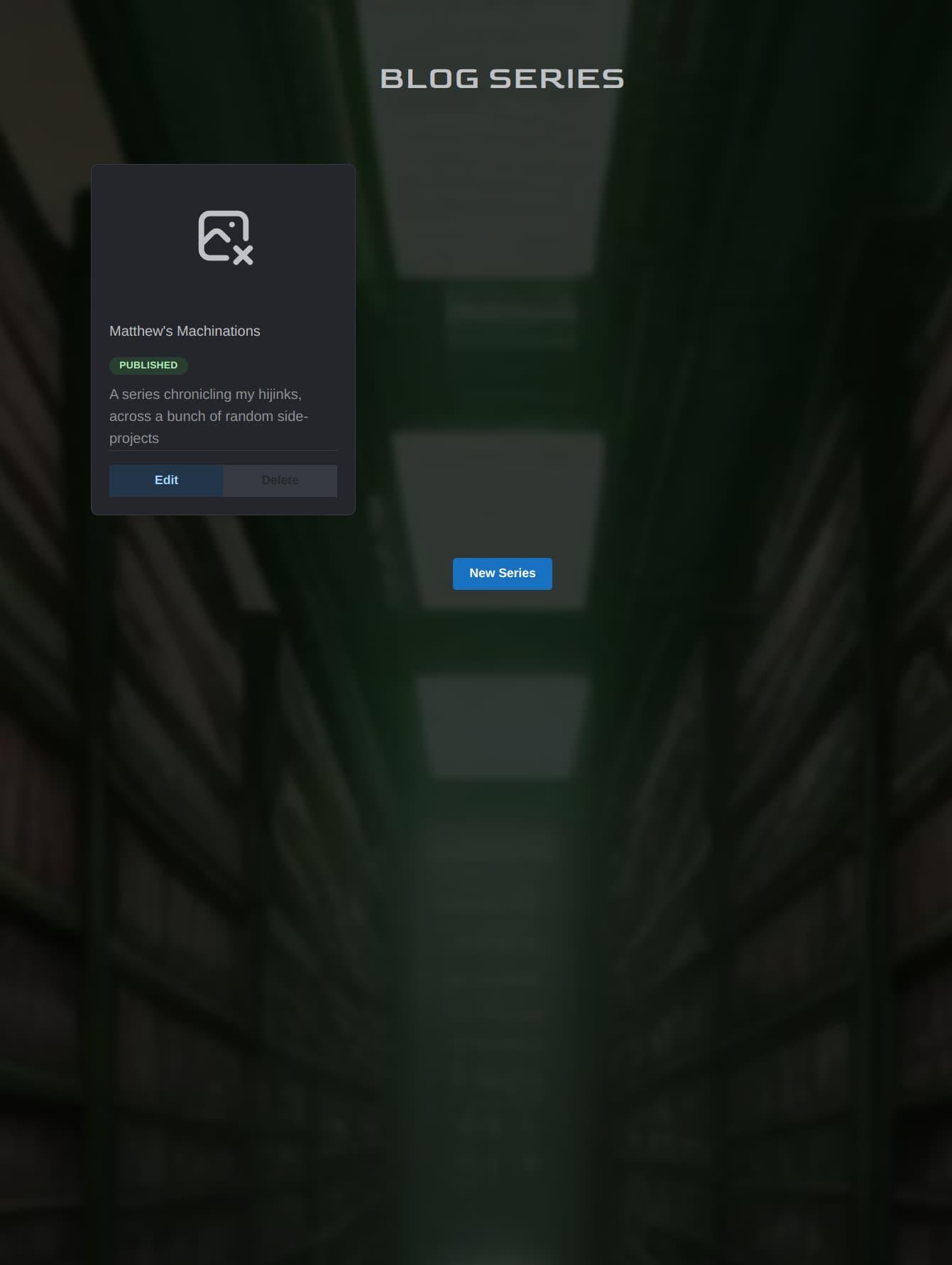
The Blog Series page
Blog series were something we especially wanted to implement, but they turned out to be quite tricky. Nevertheless, by sticking to a reasonable scope, and reusing and repurposing code and concepts we had built thus far, we added support for series to Nexus.
This is something we found to be lacking with a lot of the potential blogging solutions we looked into, but it was a useful feature for organizing blog posts in different ways. The breakthrough with series was being able to treat the individual blog posts on a series like widgets on a blog post.
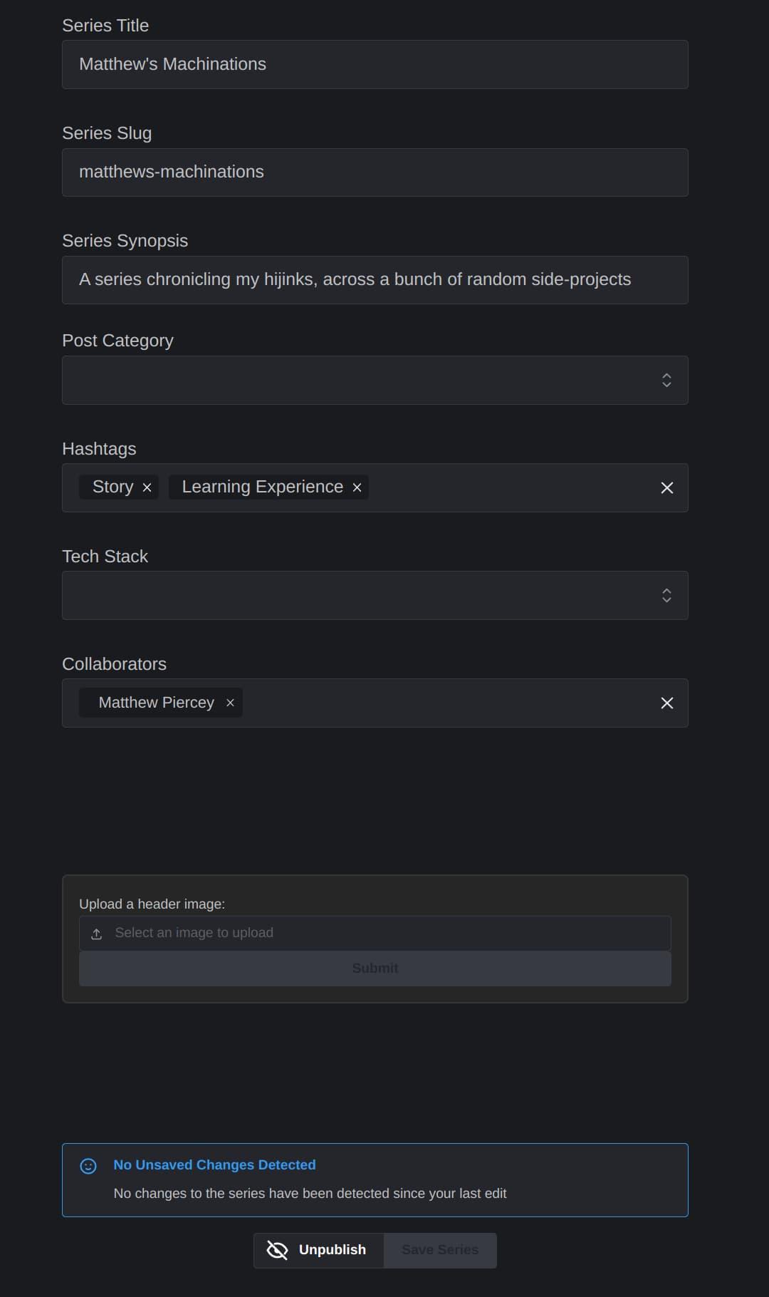
The top of the series editor
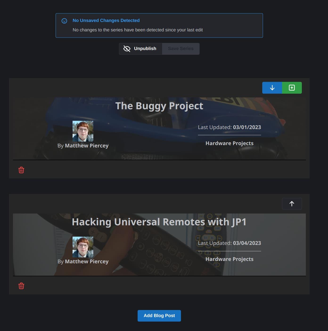
The bottom of the series editor. Note the similarities between these blog post cards and widgets
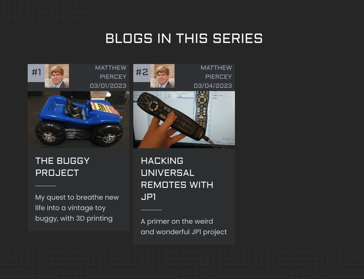
This is what series look like here on our site. But this you can see for yourself by visiting our blog!
So, we’ve covered most of the exciting stuff, but there’s one last thing about Nexus that’s worth covering here.
Like any good content management system, Nexus has an area for editing the various settings of our website. Behold!
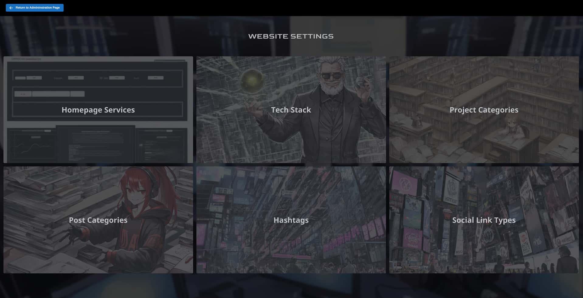
More AI-generated images here, to spruce things up
The homepage services button takes you to a page to edit the services that appear on our homepage. The tech stack button takes you to a page to manage the categories and items on our homepage’s tech stack slider. This is the same list of tech stack items that can be selected from the blog post, series, or company project editor. Project categories are for company projects, and post categories are for blog posts and blog post series. Hashtags are shared between company projects and blog posts. And finally, social link types determine the types of links that Nexus users can put on their user profile page.
Here are some images of these pages in action:
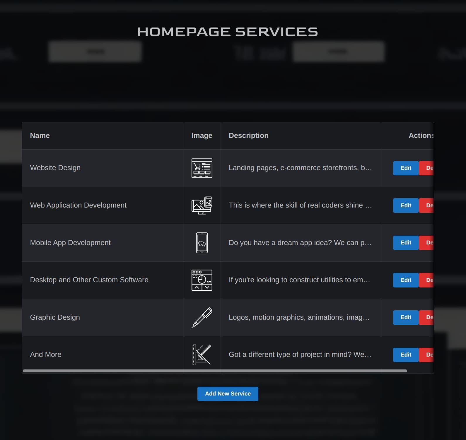
Homepage Services editor
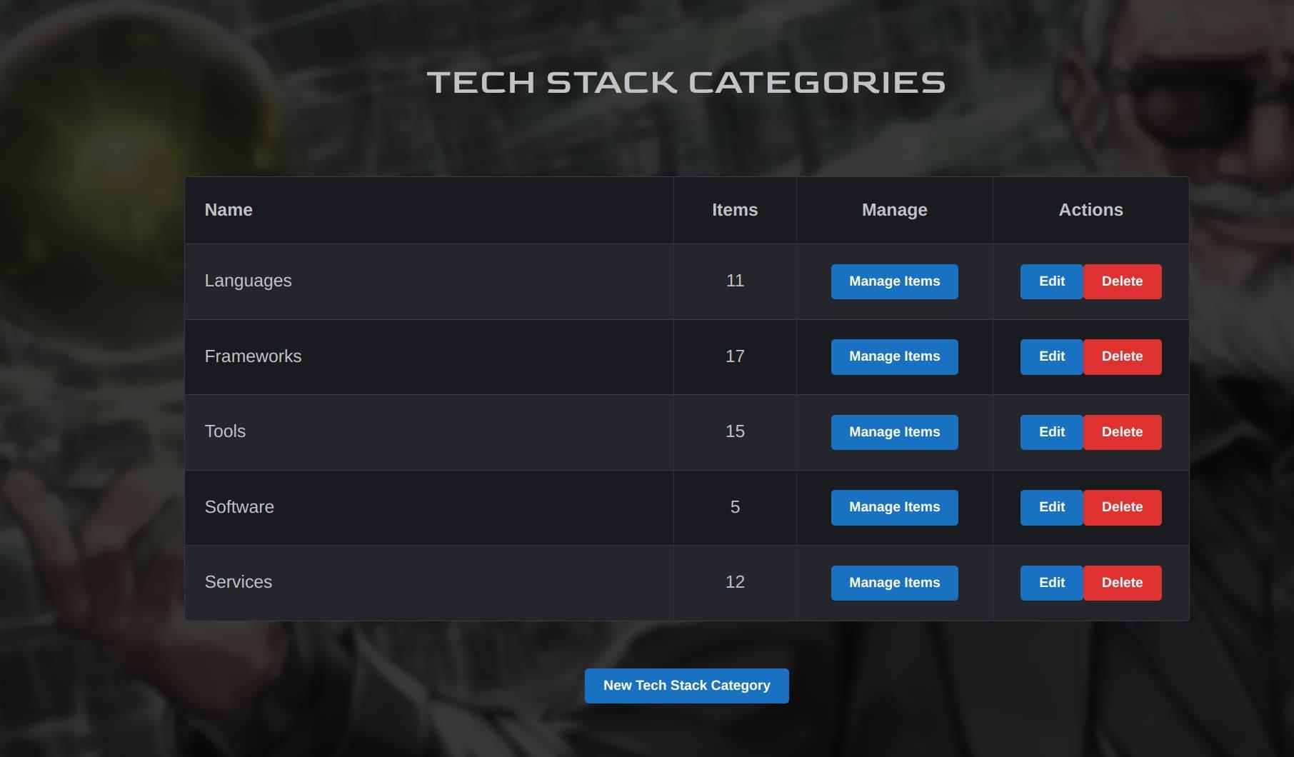
Tech Stack Categories editor
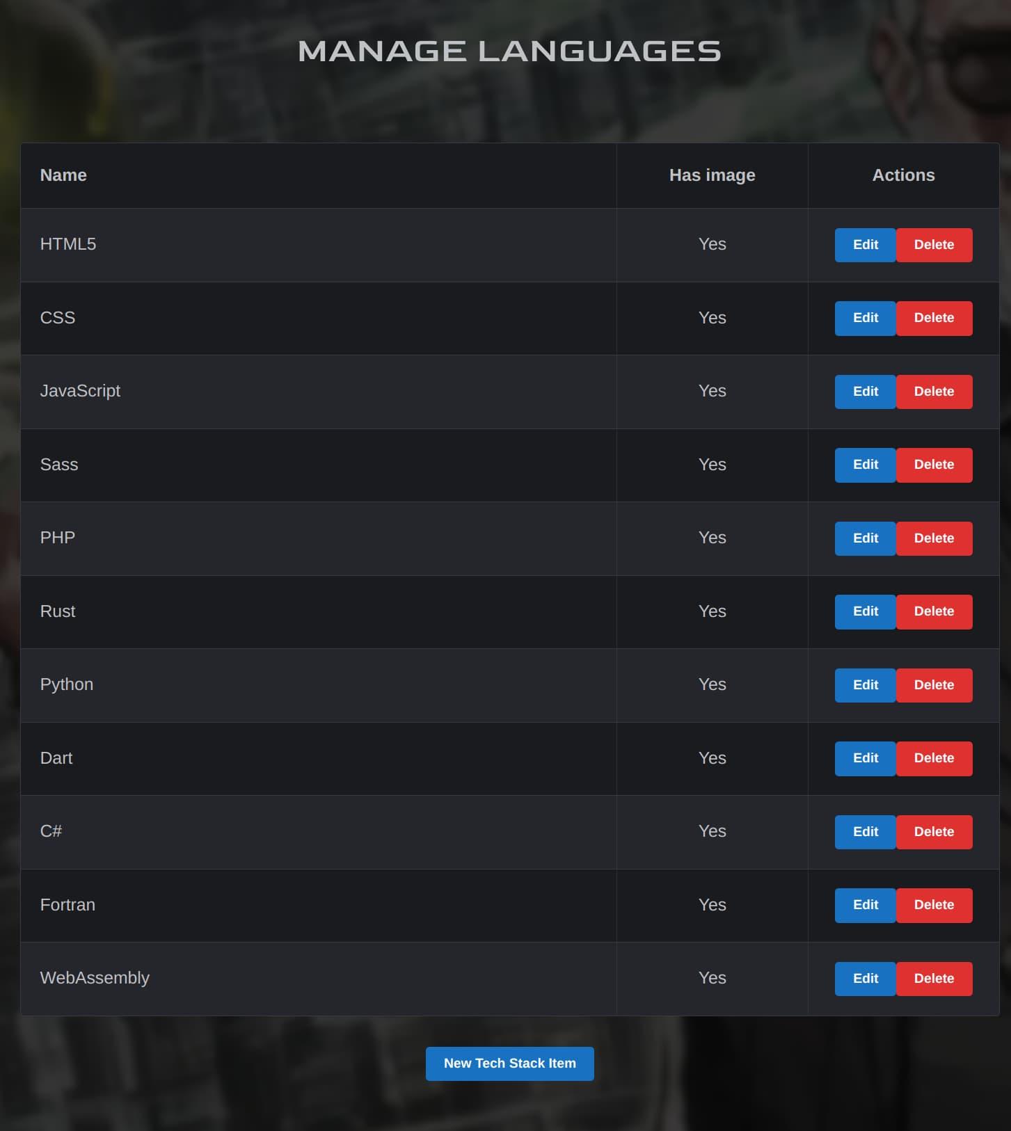
Tech Stack Items editor

Can we just take a minute to appreciate the quality of these background images? Stable Diffusion is awesome!
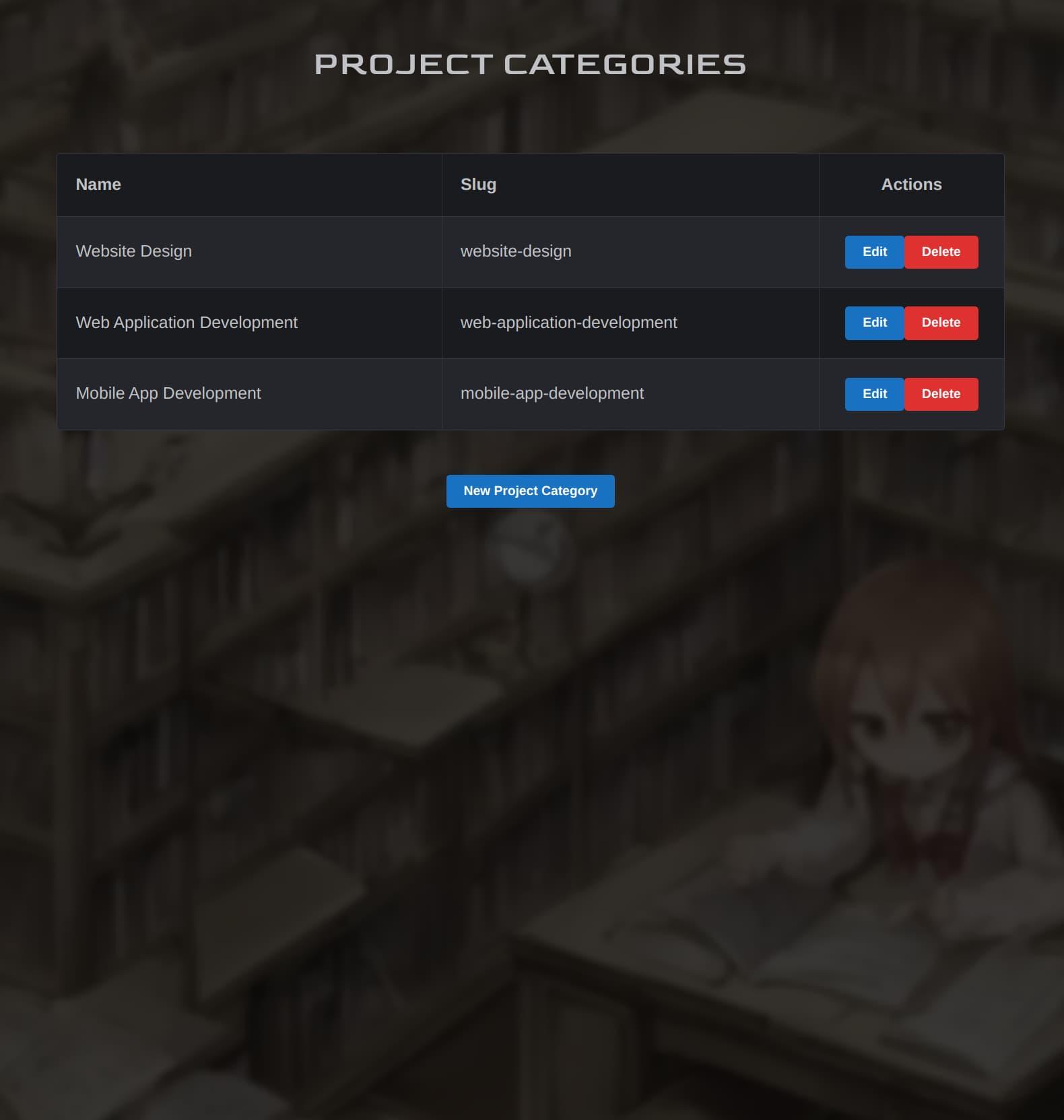
Project Categories editor
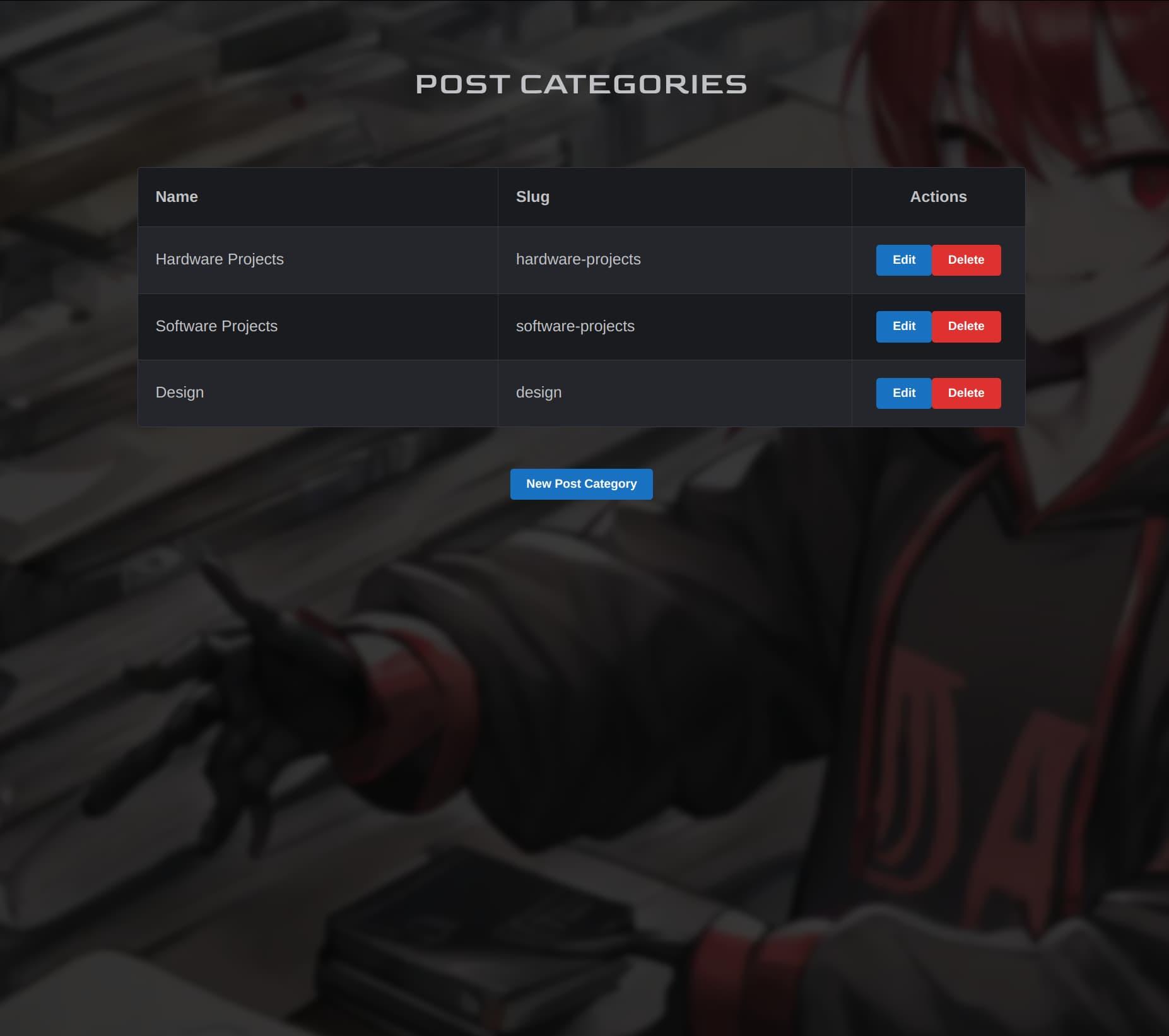
Post Categories editor
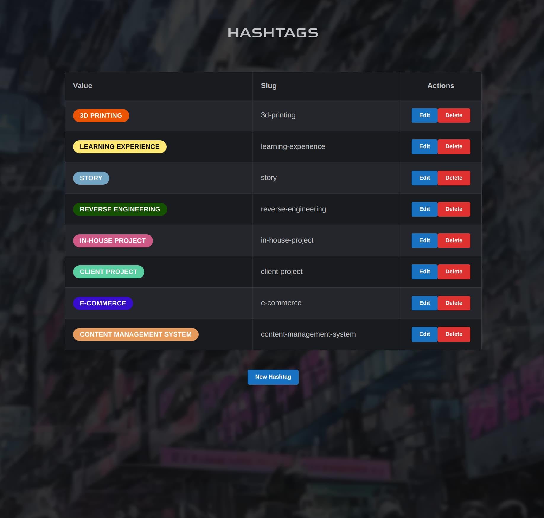
Hashtags editor
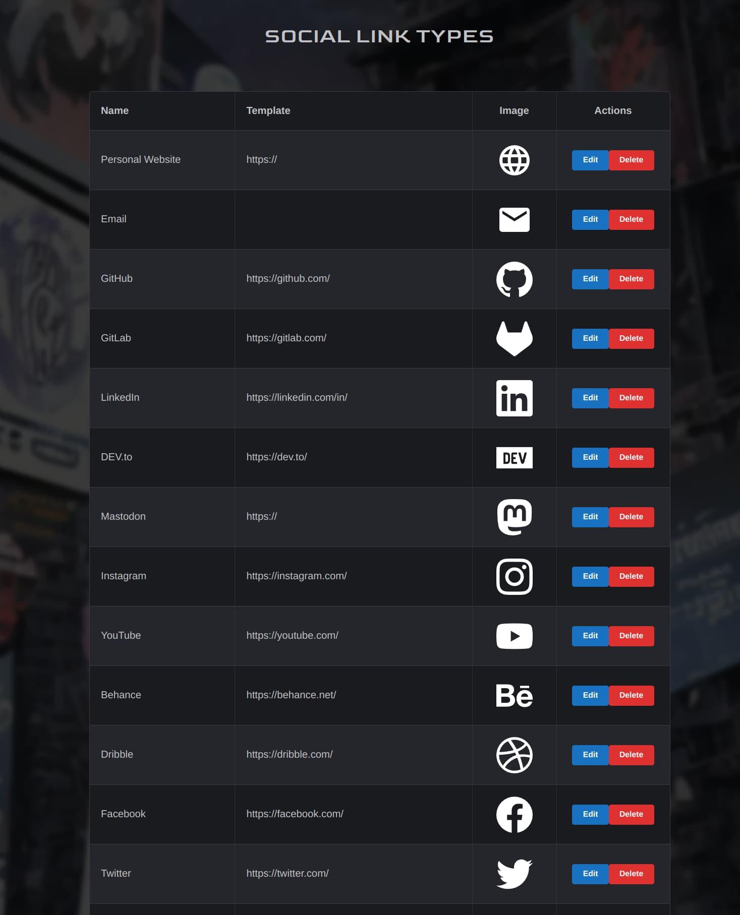
Social Link Types editor
And that about concludes our tour, folks. Hope you enjoyed!
Now that you’ve seen Nexus itself, check out the rest of our site to see what it’s enabled us to build! Nexus may not be perfect, but it’s very powerful, easy to use, and built exactly to our own requirements. And there is still room for Nexus to grow and be improved, as its codebase is still easy to manage and work with.
And now that we’ve made this, our team has the confidence and ability to take on more of these types of projects for our clients. So whether you’re in need of a simple site or online store for your business or project, or a completely-custom web application like Nexus here - we’re up for the challenge.
And you can rest assured that we here at OverScore will continue to expand our capabilities, keep up to date with the latest and greatest tools, research new ways to develop websites and web applications, and build custom tools when necessary - for ourselves and our clients.


